1940s house redesign, rip-out, reinstall and redecorate (five year project)
Interior furnishings and fabrics for a modern reinterpretation of a 1970s home
A full Georgian property redesign
Removing, redesigning and installing two new bathrooms in a 1980s home
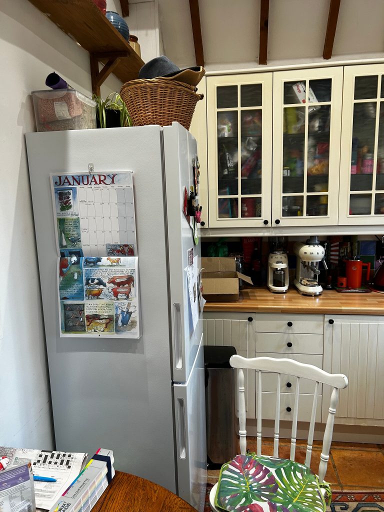
A redesign to create better seating in the kitchen
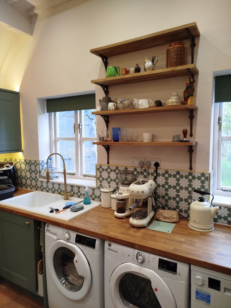
Before: The customer had moved into a home with a poorly laid out, rather dated kitchen which was showing its age.
Before: The cupboards were unuseable due to the fridge, making the space for dining very cramped.
Before: During the initial client discussion it became evident that more room to entertain was the primary aim.
Before: A wall unit cluttered the room and the hob and oven were next to a wall making it awkward to use.
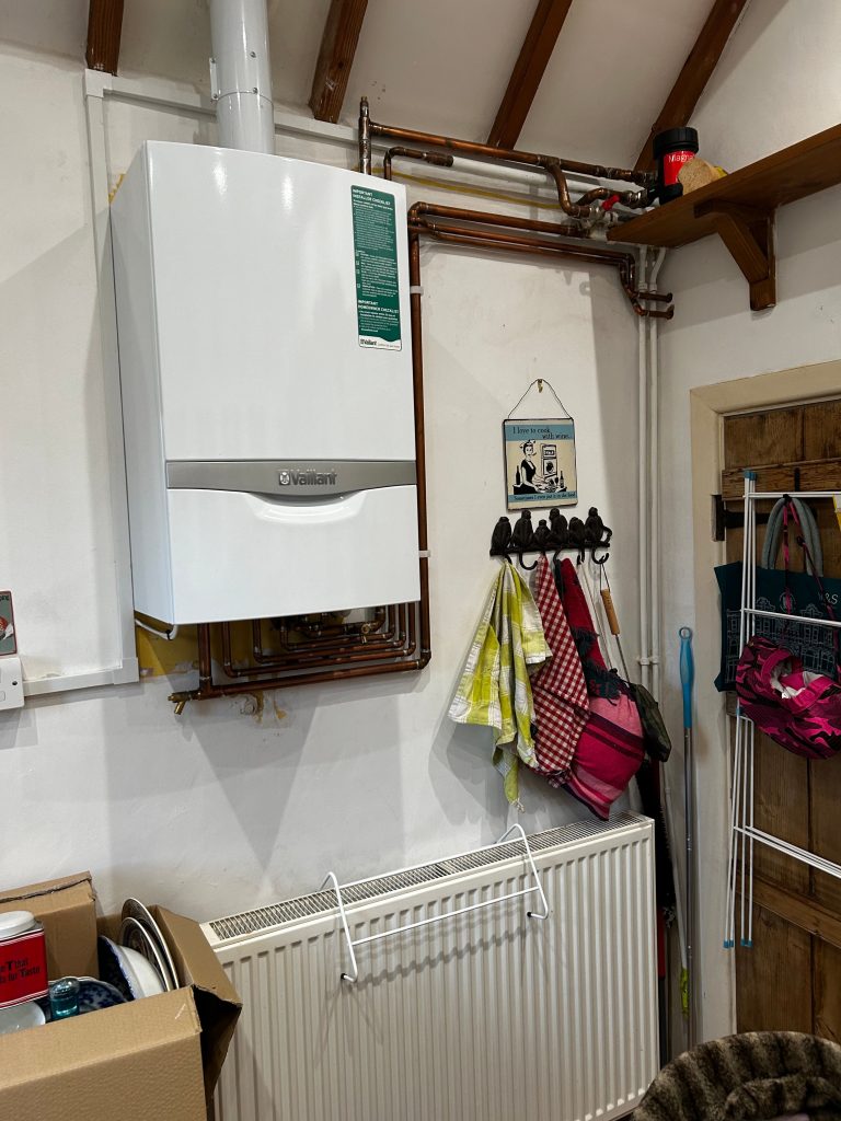
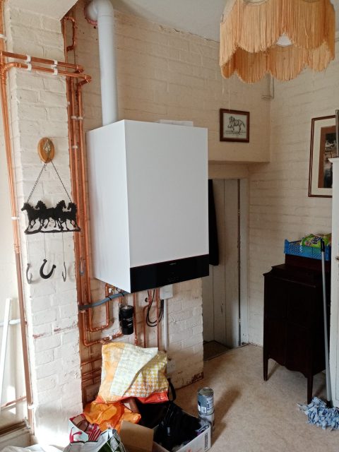
Before: A new boiler and a lot of pipes created a cluttered look which would take skilful planning to disguise.
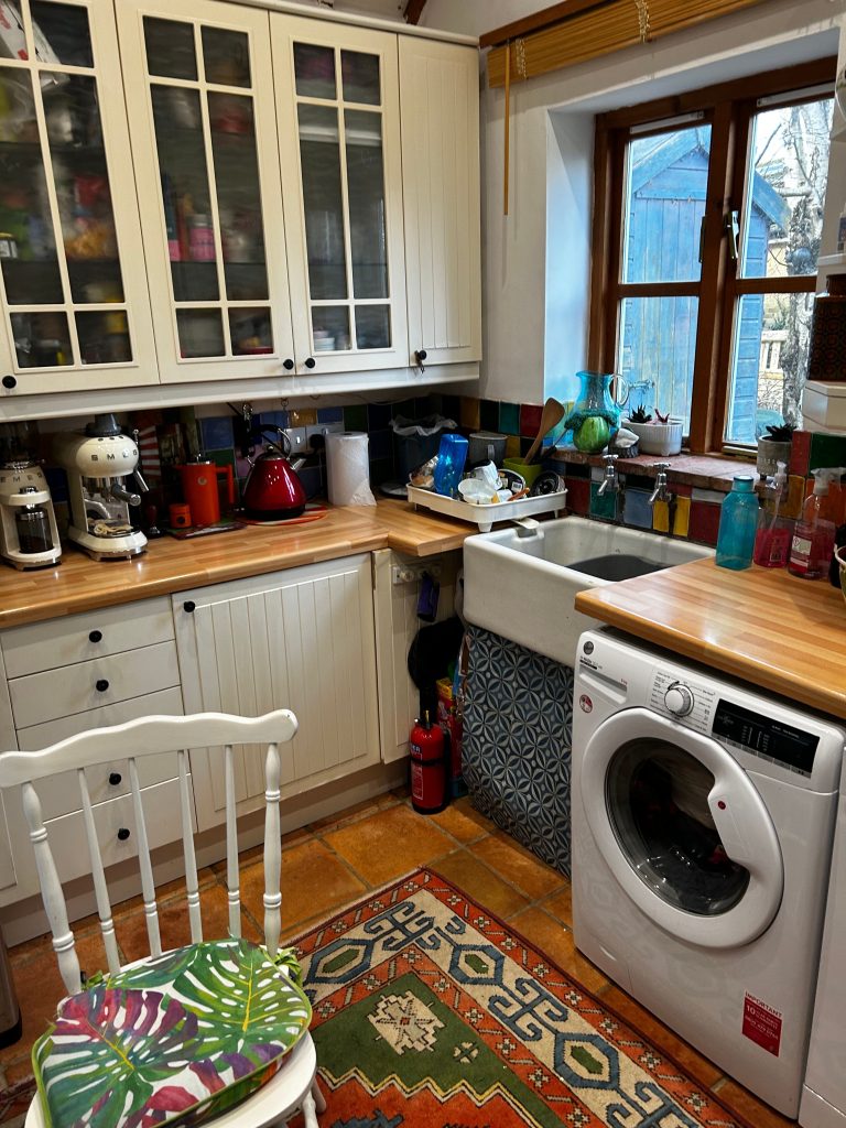
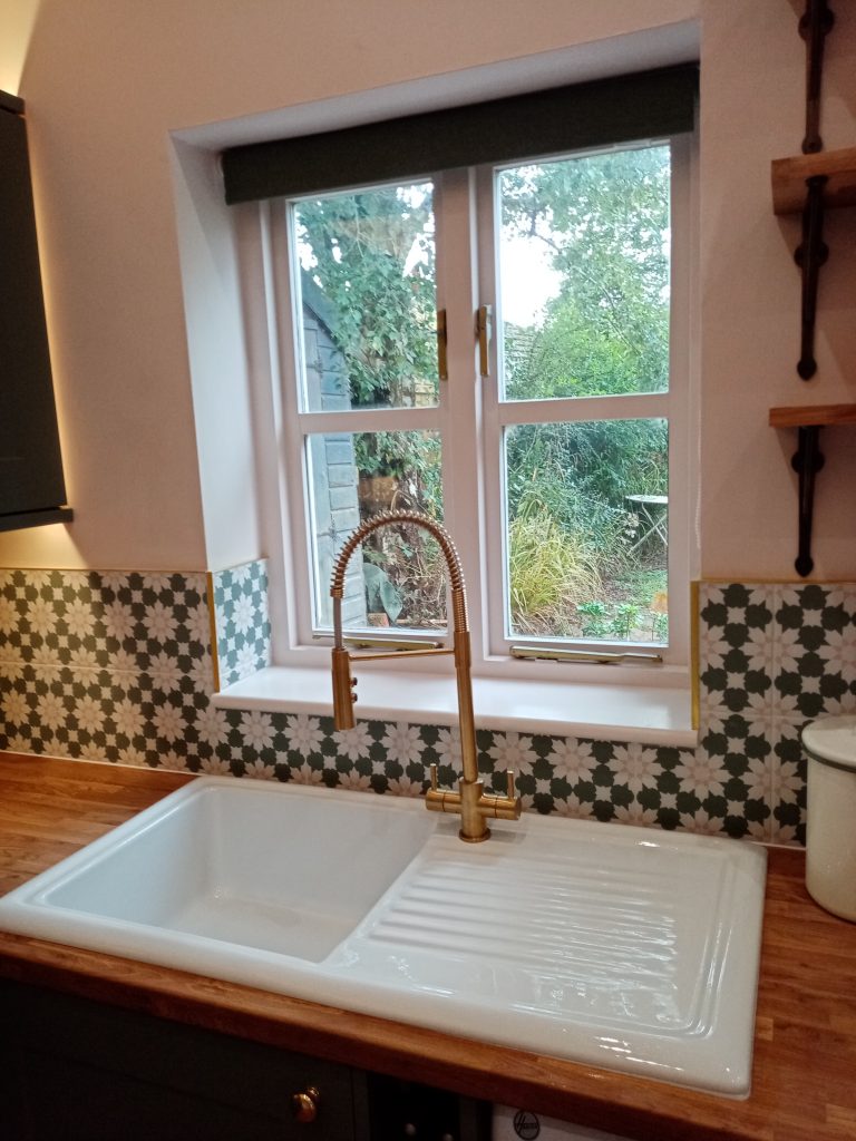
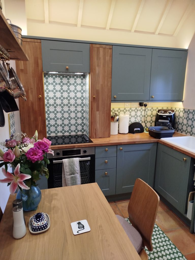
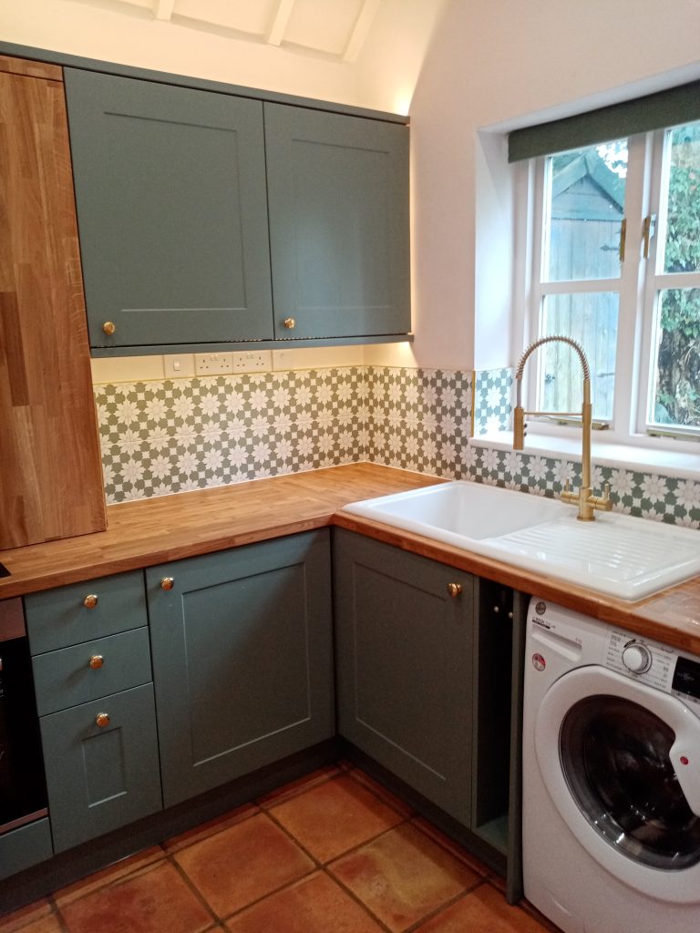
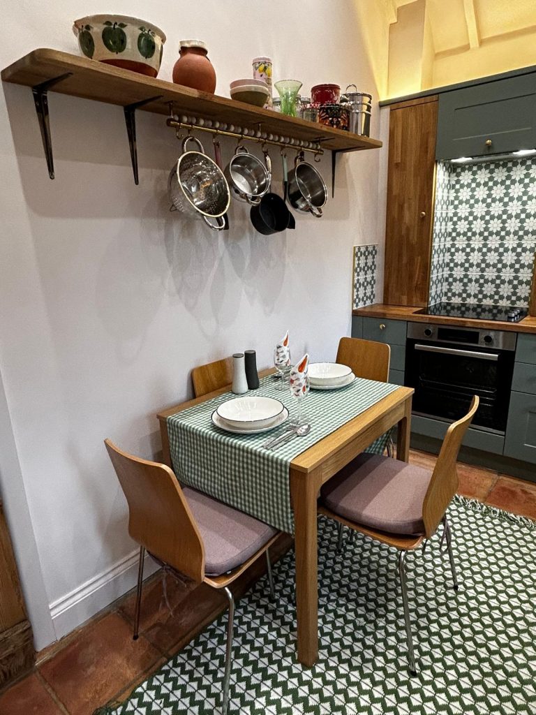
After: After overcoming the room’s many constraints, we chose a sage green and pink theme with brushed brass accents.
After: The end result is a huge and fabulous improvement. Just by changing the layout we’ve improved flow and comfort. Bespoke wooden hob cupboards disguise pipework.
After: I used every inch of space for storage and organisation. I added lighting above and below the units to highlight the ceiling.
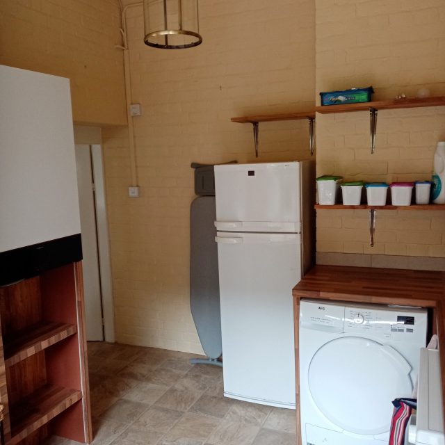
After: I’d have liked to hide the white goods but they had all been purchased just prior to the redesign so were incorporated.
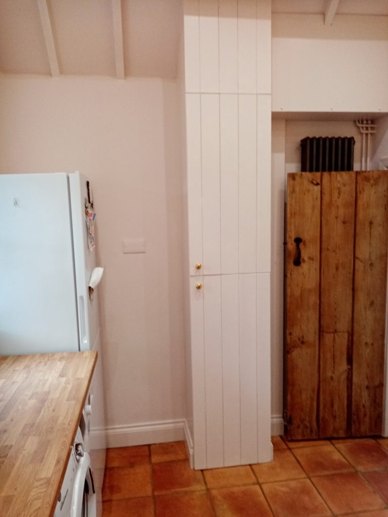
After: I placed the fridge where the oven had been and Faringdon Handyman, who installed the kitchen, built a cupboard to hide the boiler, pipes and bins.
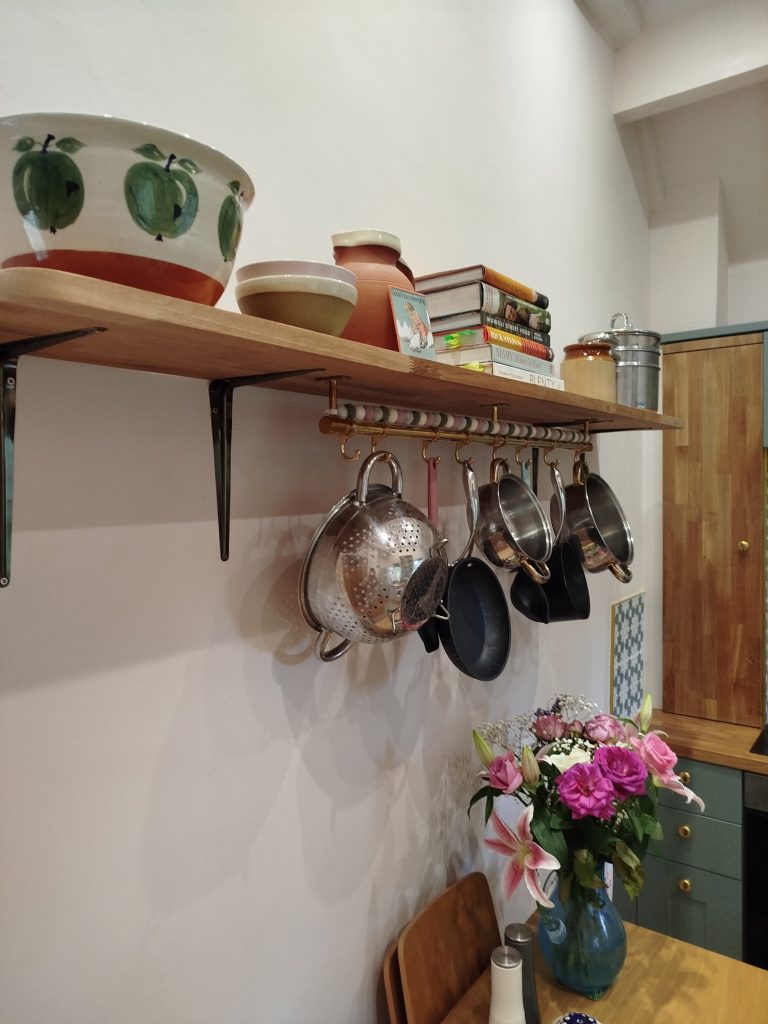
After: To save cupboard space I added new oak shelves to match the bespoke oak hob cupboards and a Batterie de Cuisine for pans.
After: The customer has enough space to seat four with ease, can easily access her cupboards and the room is coherent and attractive.
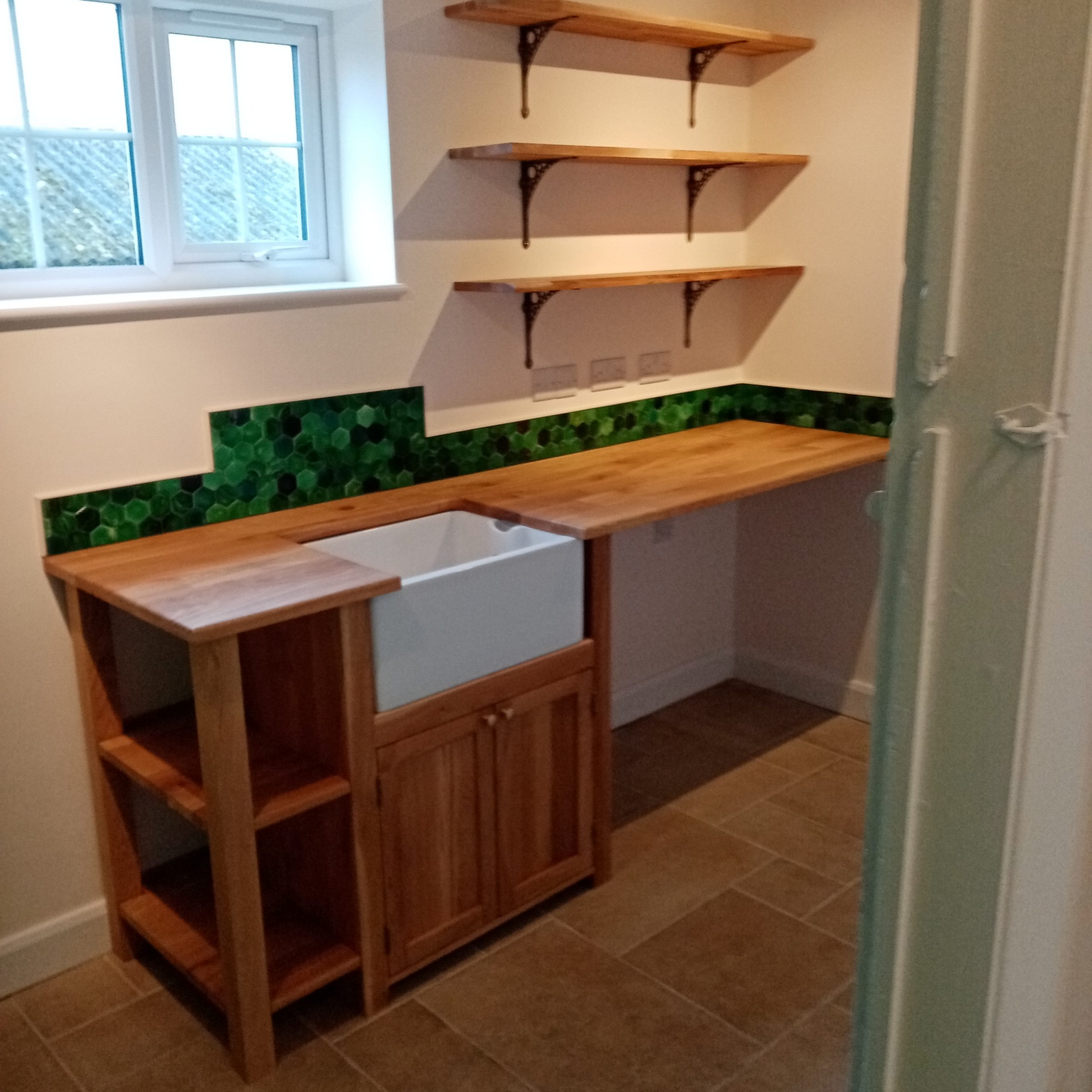
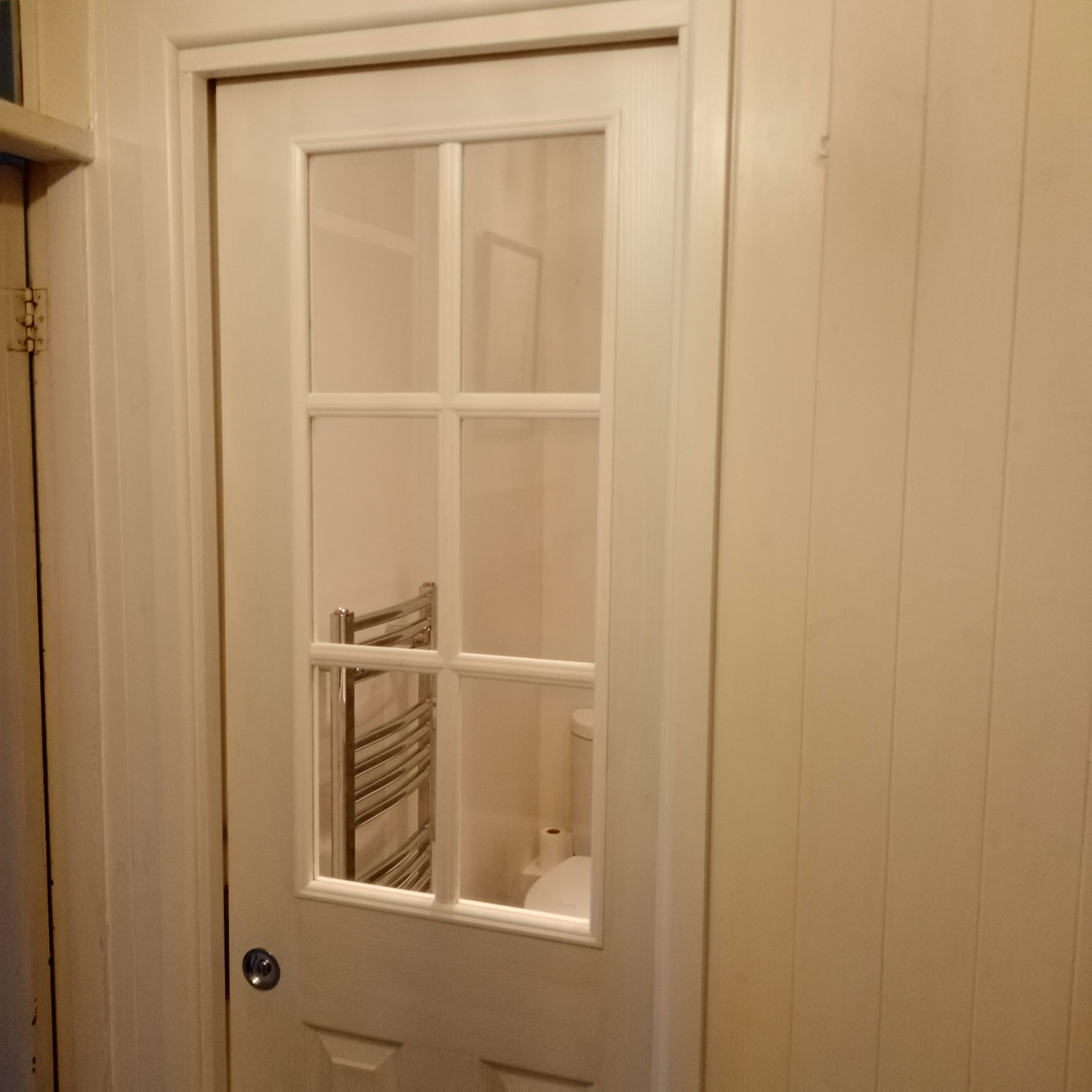
From the 1940s to 2023
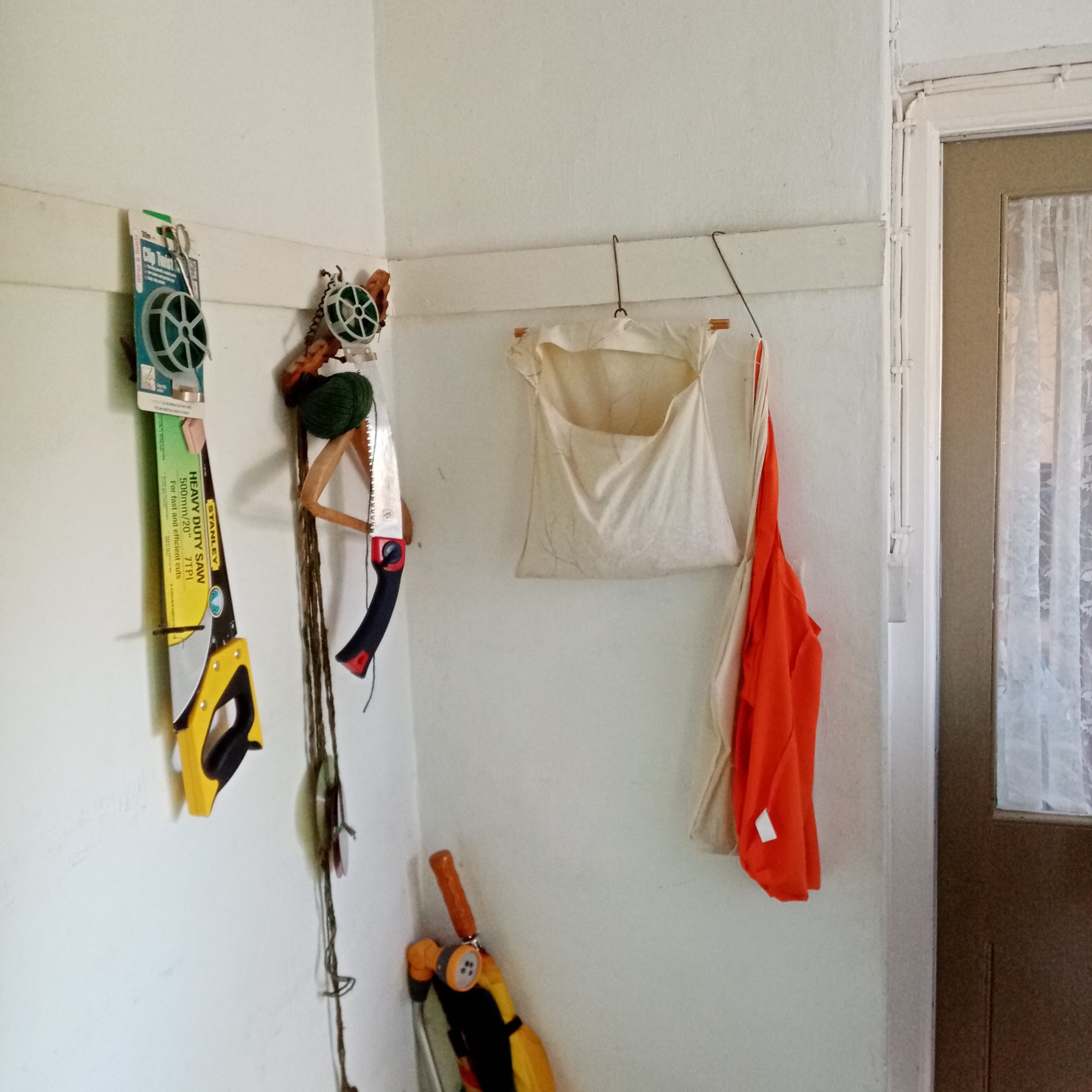
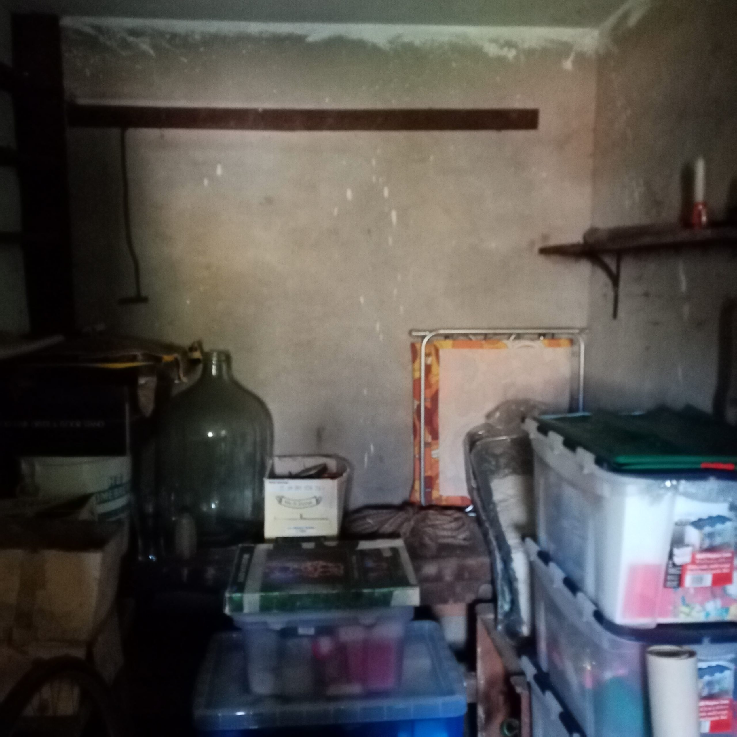
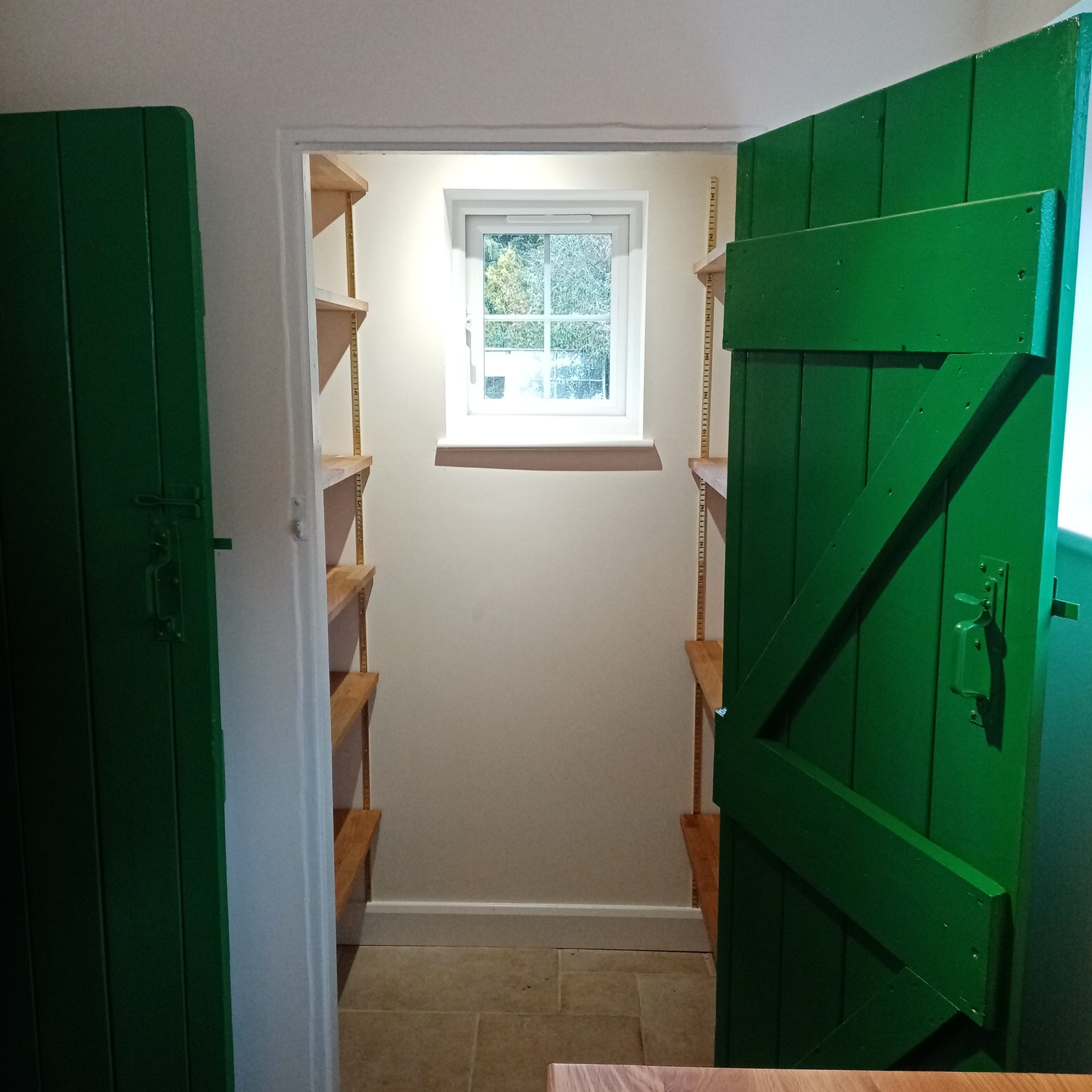
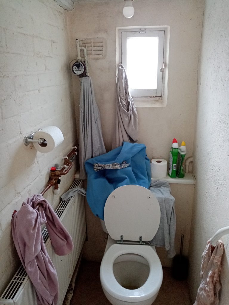
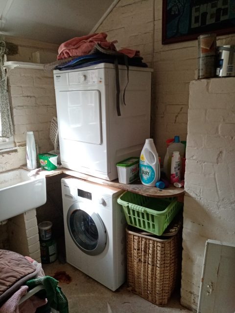
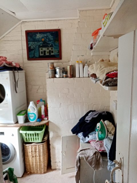
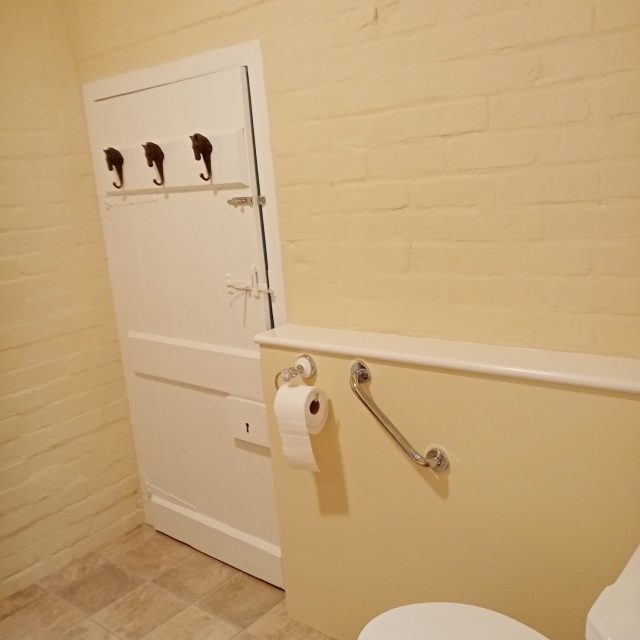
This large project saw a redesign to hall (shown), storage room, workroom, coal hole and loo. Some items dated from the 1940s when the house was built.
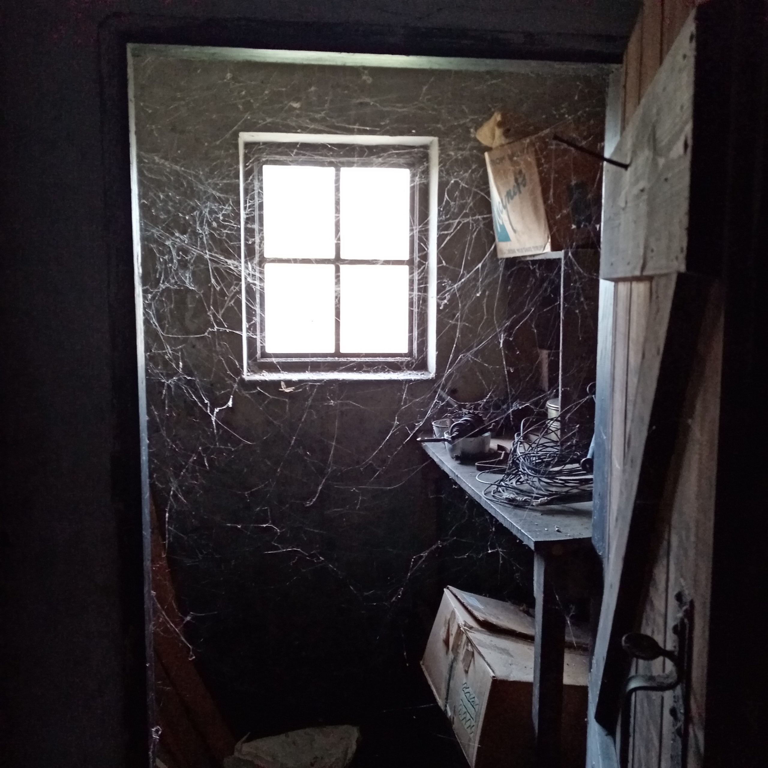
The door to the Coal Hole hadn’t been opened in 10 years….and was black with coal dust and thick with cobwebs.
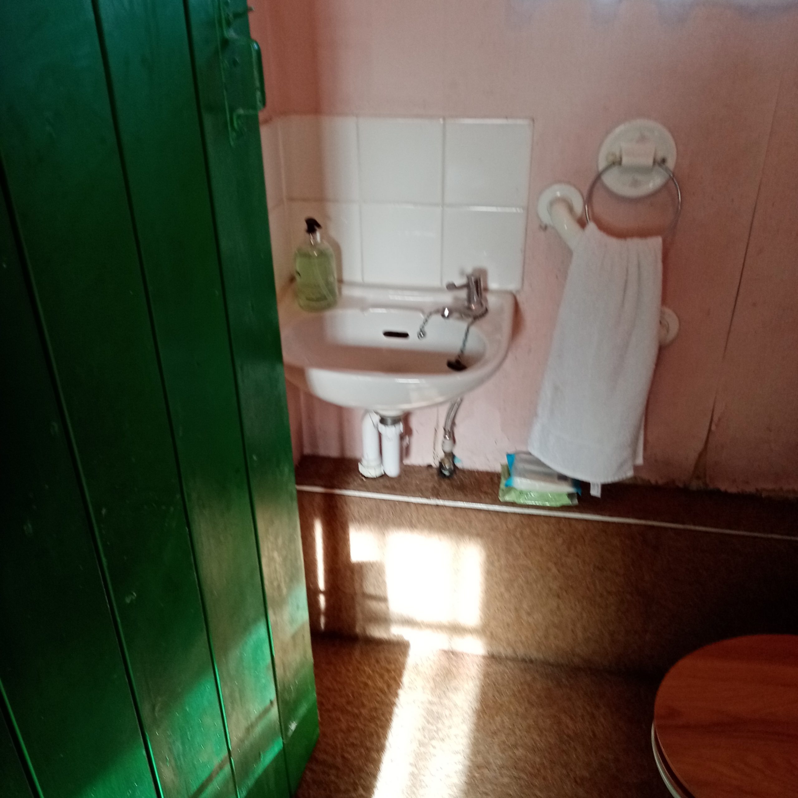
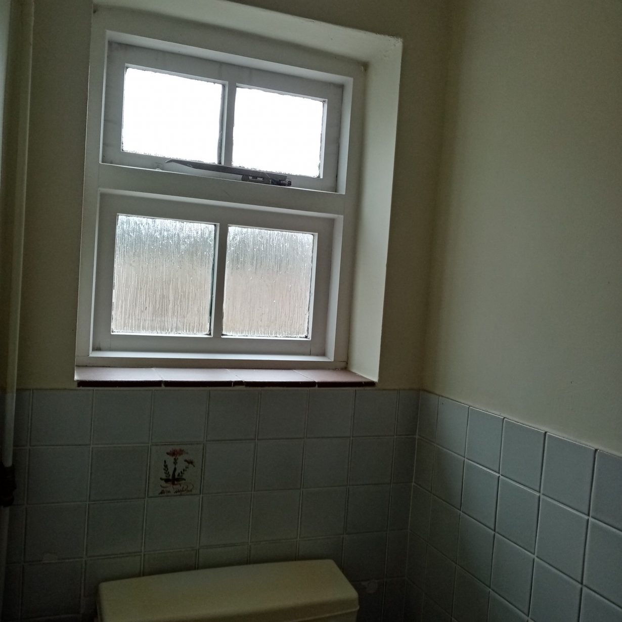
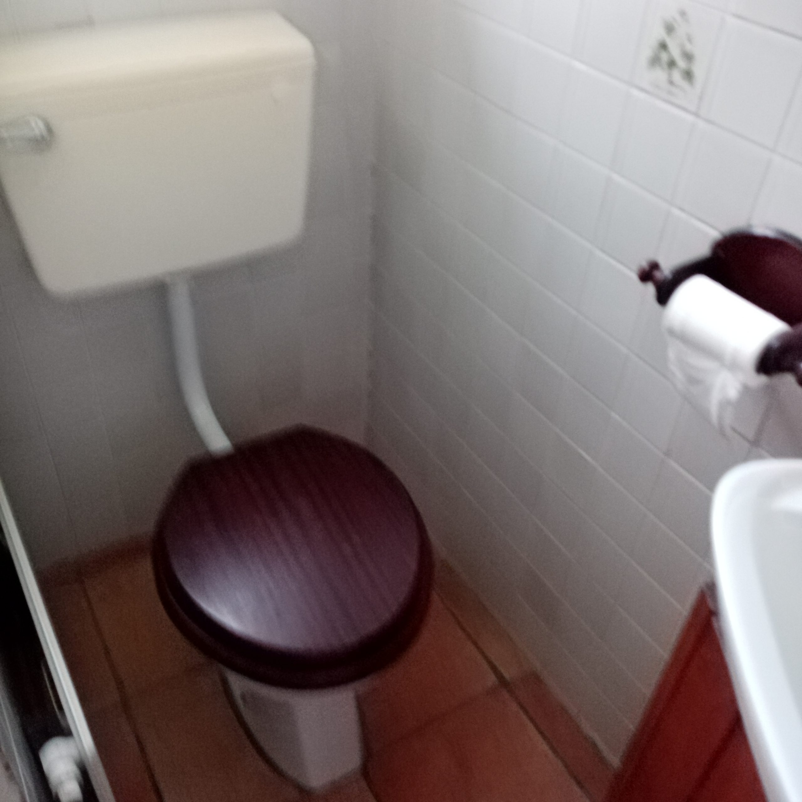
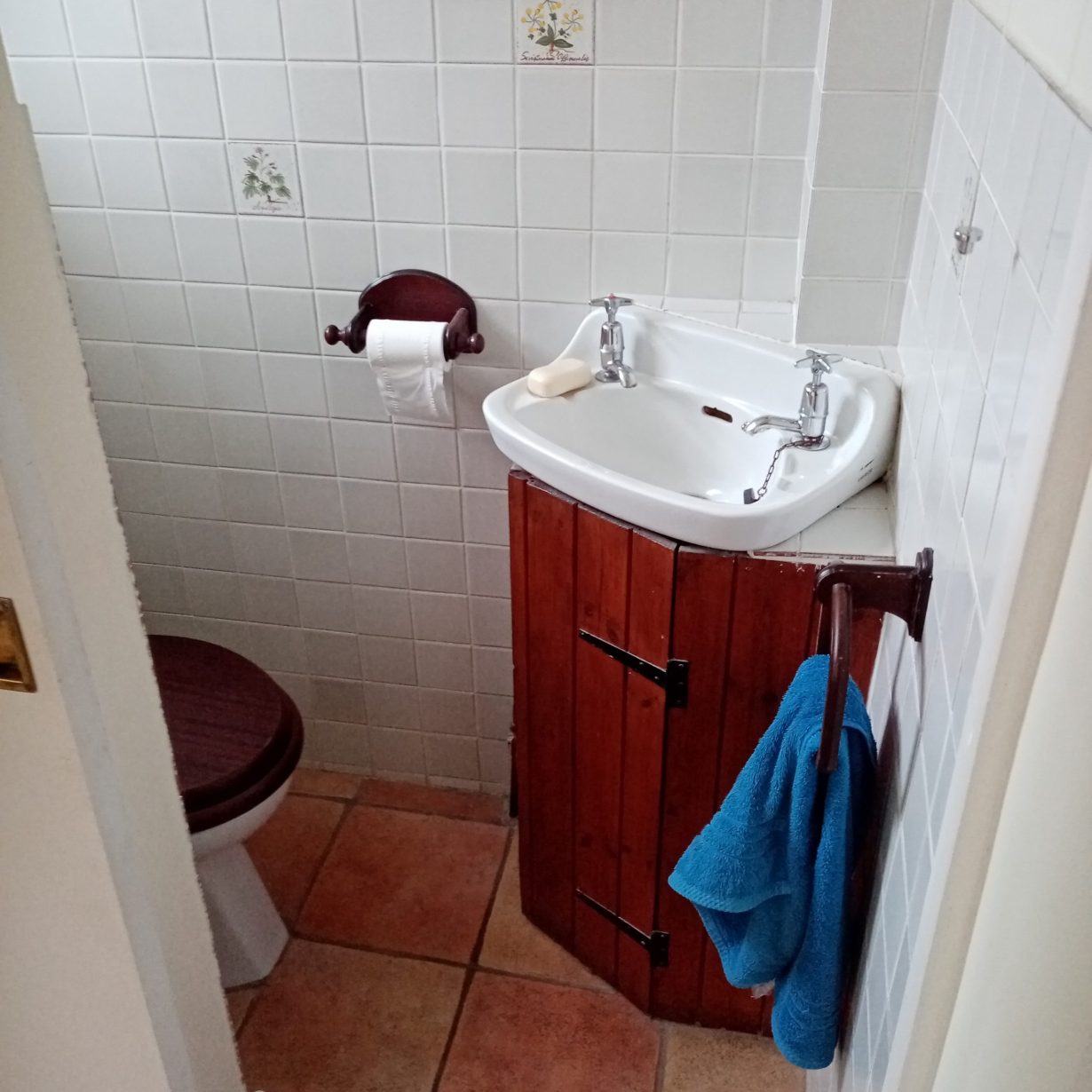
The loo featured a woolly wall shelf and carpet, peeling paper and adhesive polystyrene roof tiles – hello 1970s! It also had the original 1940s green door.
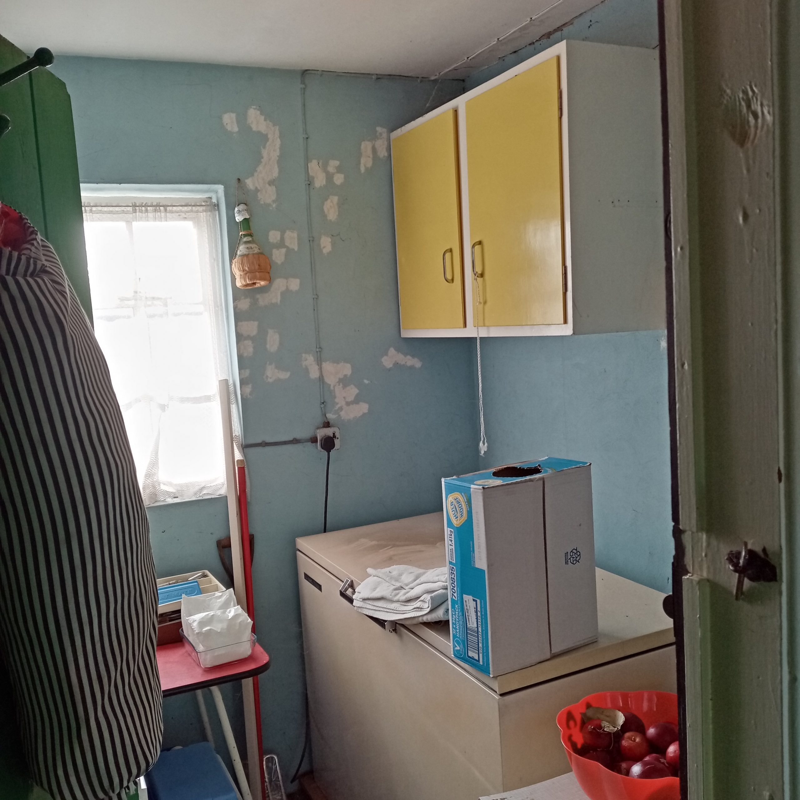
A reasonably sized room was underused. All the electrics and pipework to all the rooms were visible.
This workroom had been disused for about 20 years as there wasn’t any lighting or heating; the space was used as storage.
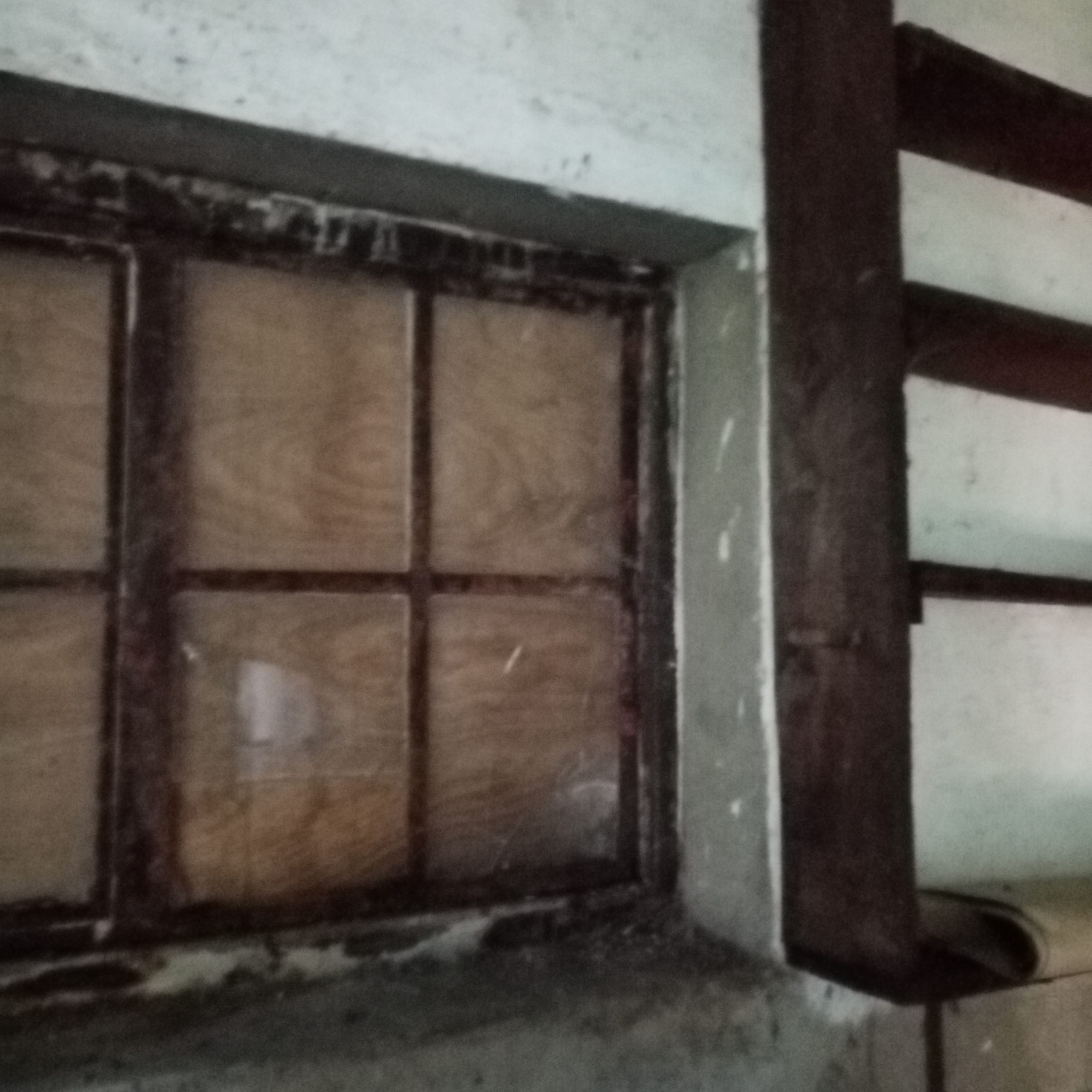
After designing the new spaces, the first step was to replace the rusted, broken Crittall windows and 1970s back door.
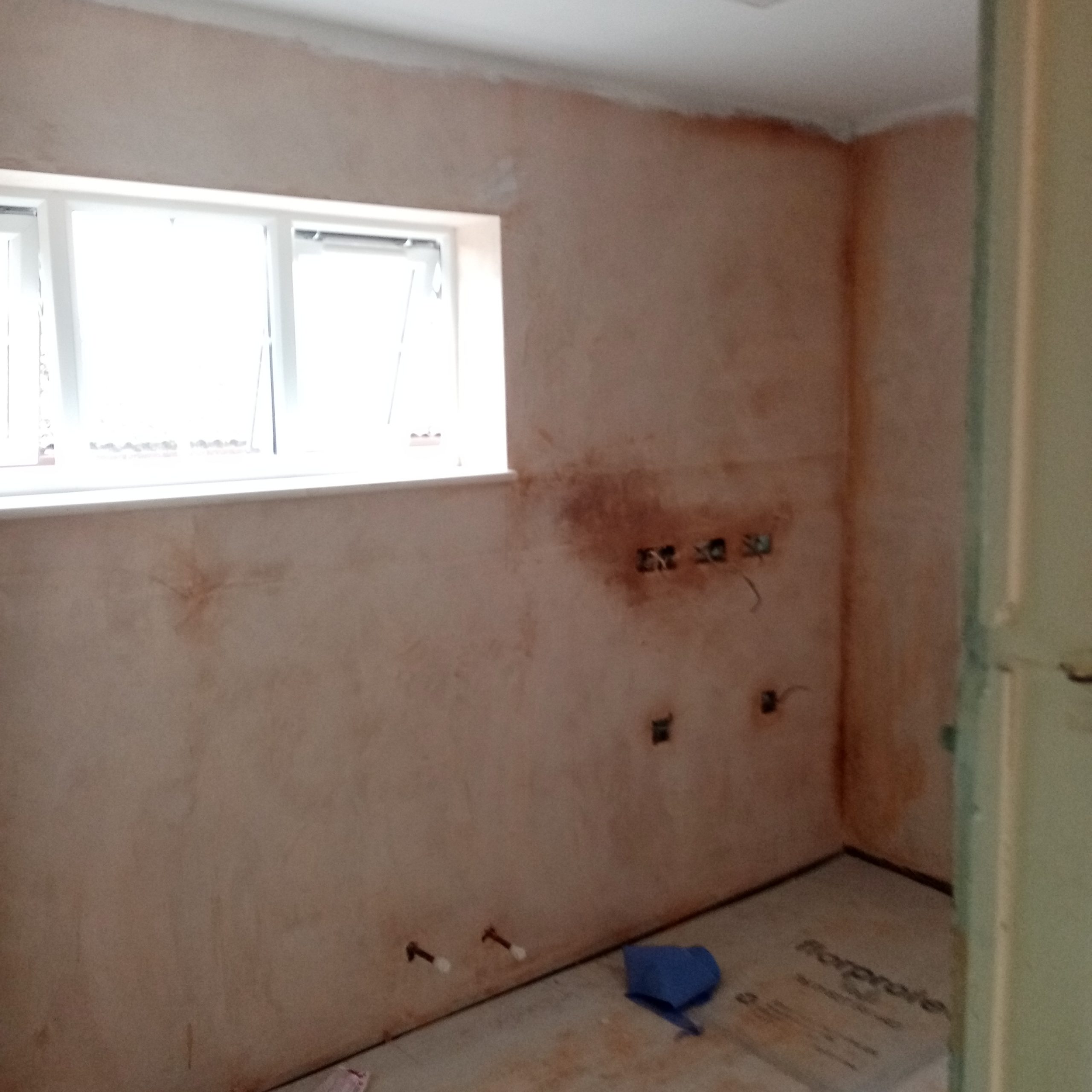
Faringdon Handyman battened out and insulated the external walls, Sean O’Donnell plastered the walls and ceilings, Mike Heasman put in new electrics throughout and Paul Pounds fitted new windows.
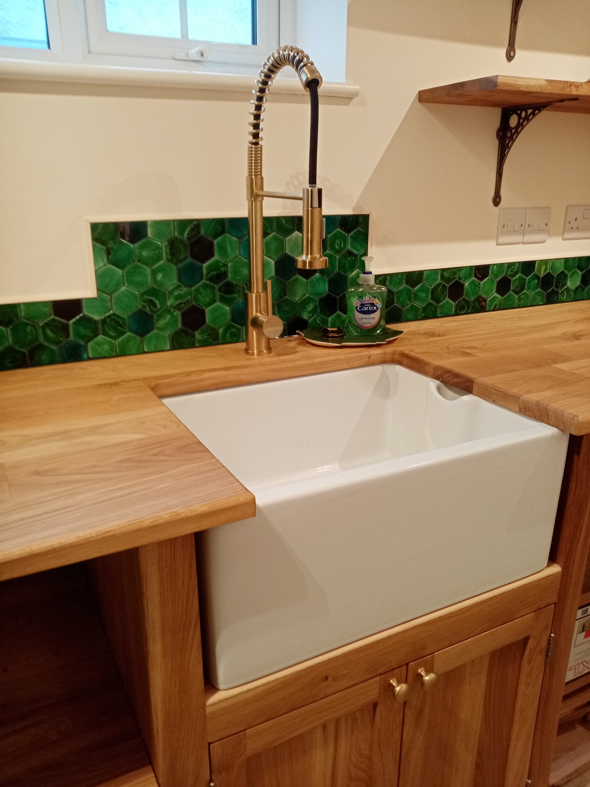
The customer agreed to keep the original doors and bakelite switch. The vibrant colour led the whole project, with a palette of greens, browns and creams and a cream tiled floor in ‘Devon Bone’.
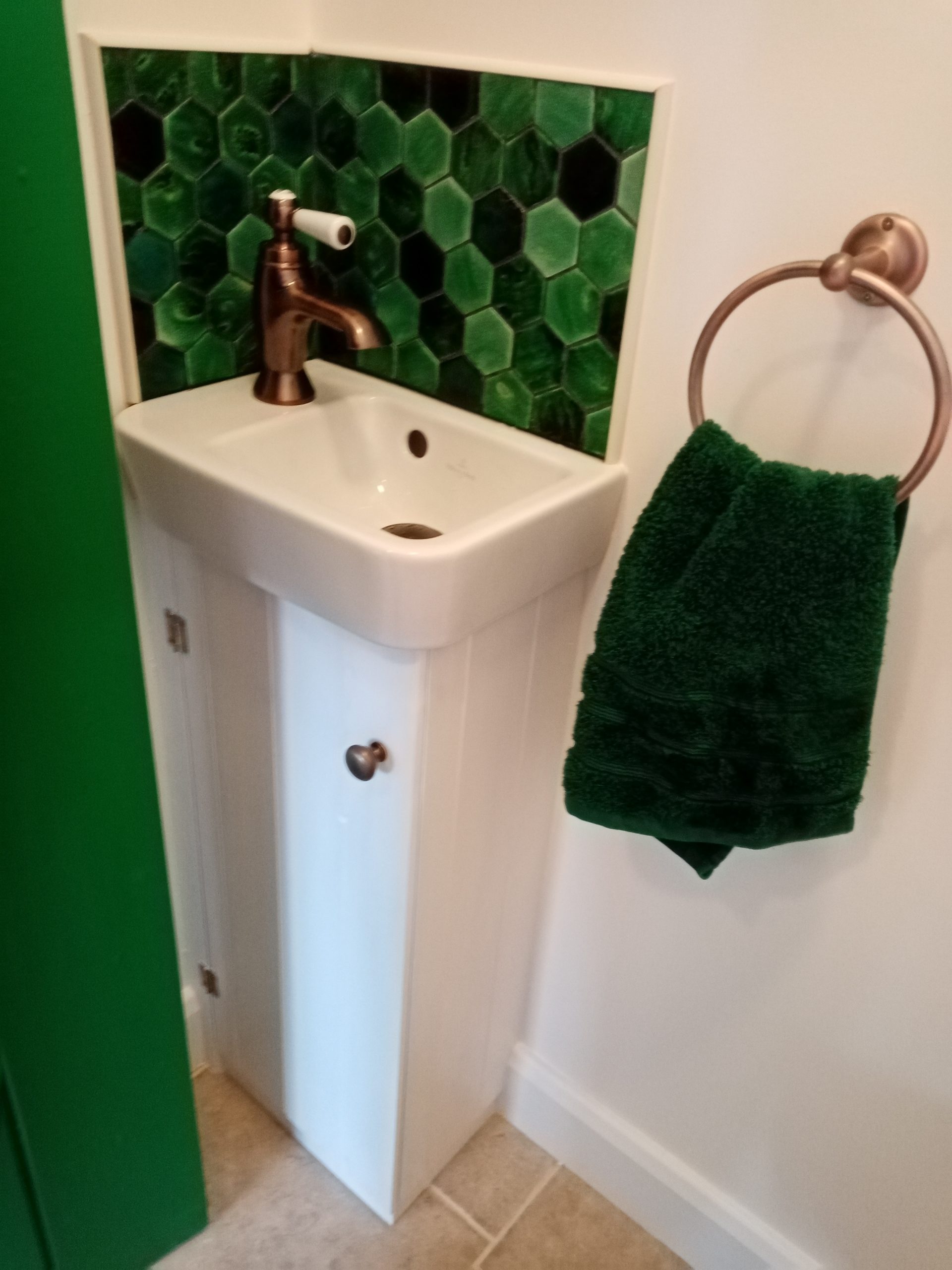
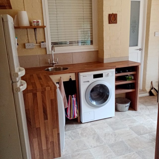
For the cloakroom I found a tiny basin and warm brass fittings in a traditional style. Faringdon Handyman made a tiny cupboard to my specifications. I chose tiny hand painted glass hexagons for splashbacks.
The finished utility room is light and bright with room for appliances and storage. The opposite side features a pull down airer and slim storage.
I suggested handmade oak fittings and antique brass lights, brackets, taps and waste. The look is pared back, miminal and natural – modern 1940s style.
We fitted solid oak shelves to the pantry and scullery; these are on brass bookshelf supports for greater flexibility of movement.
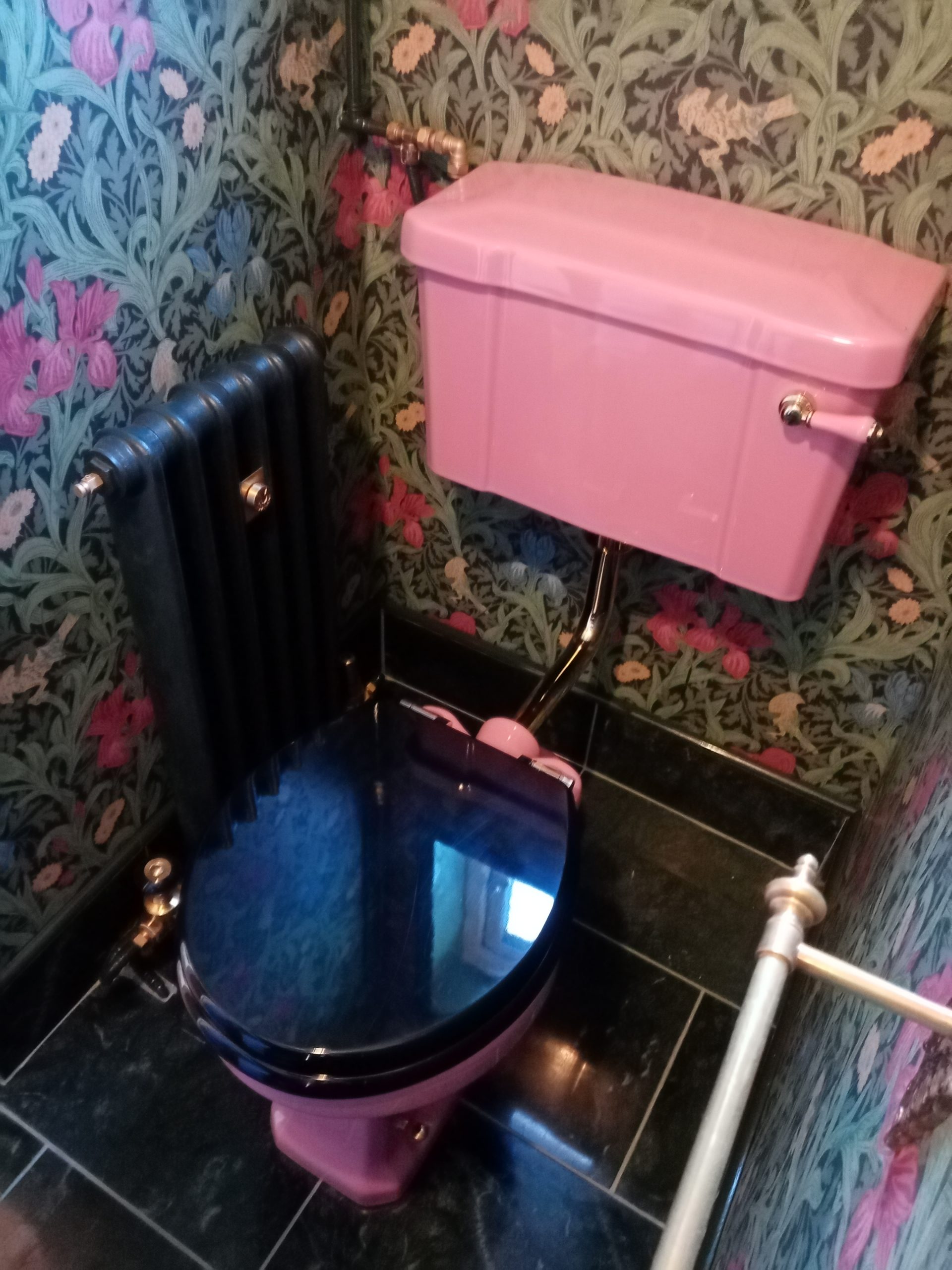
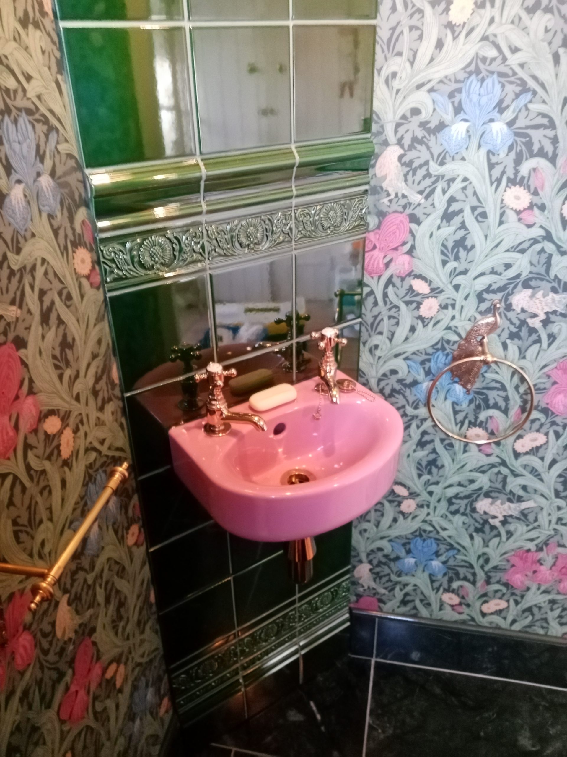
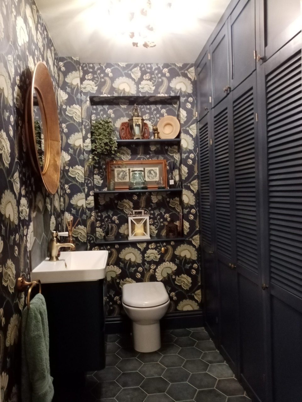
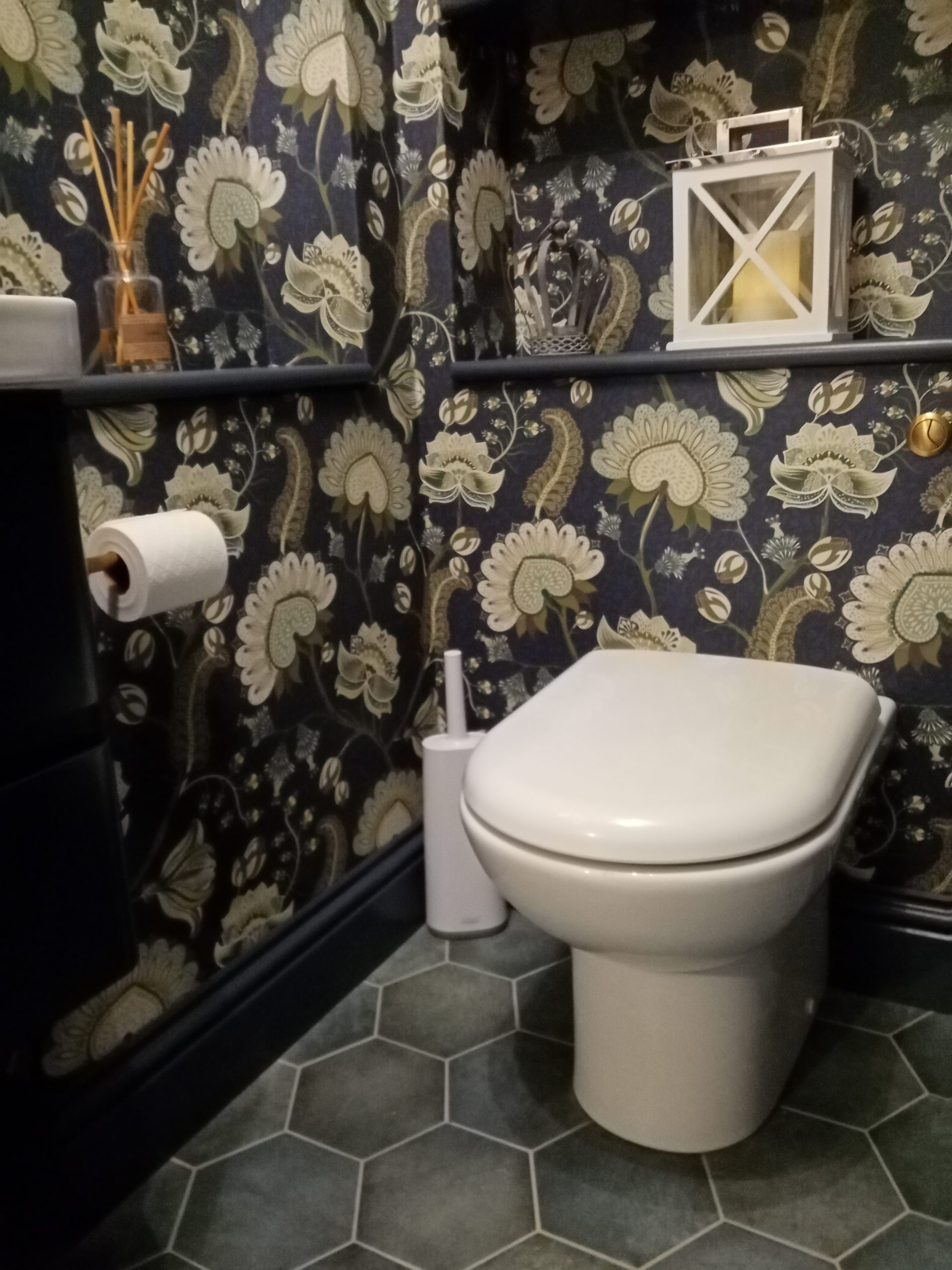
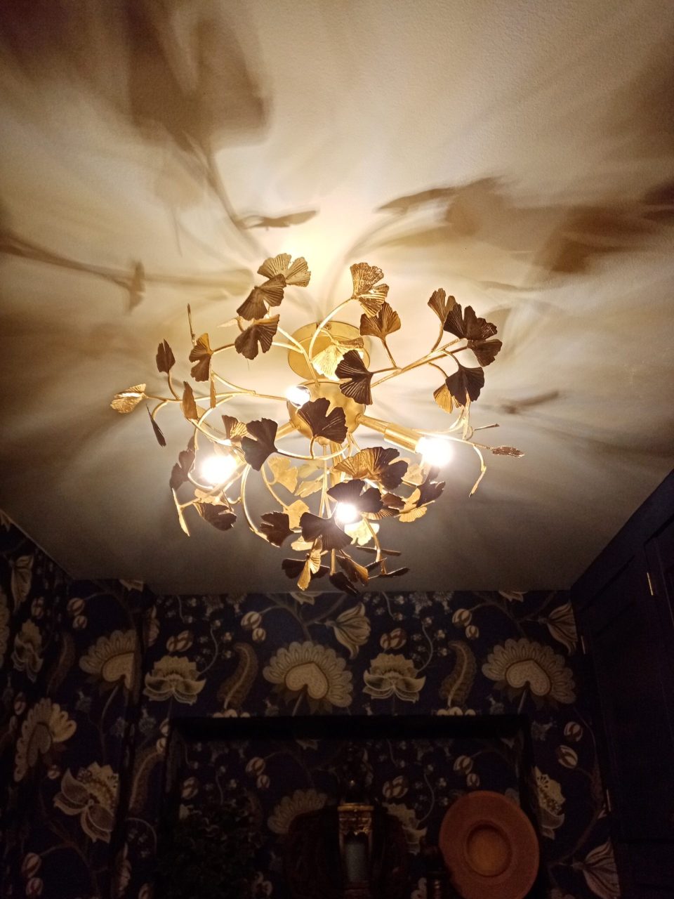
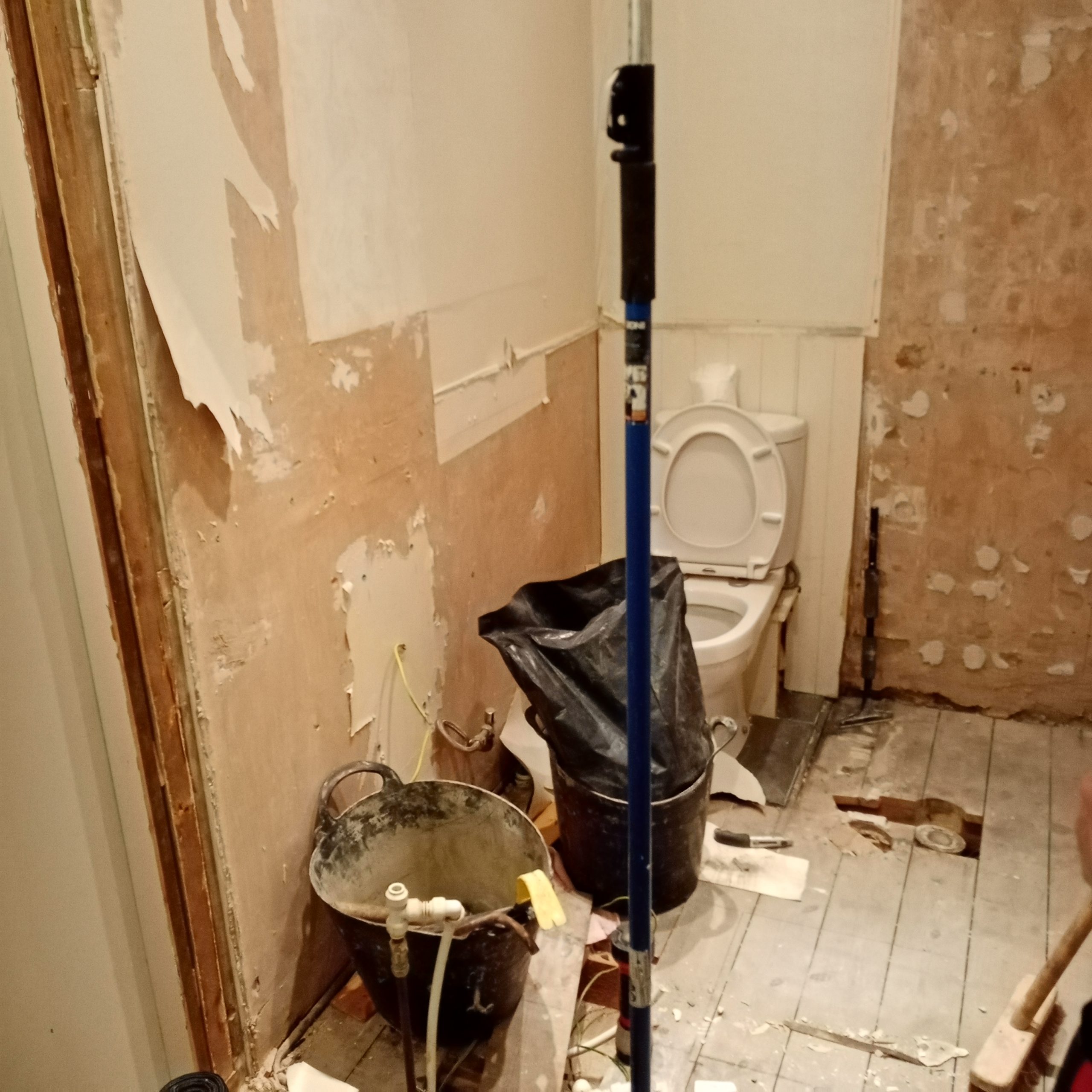
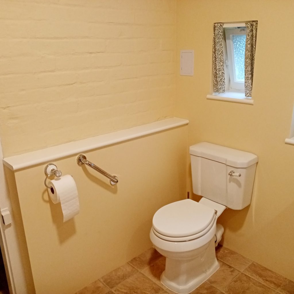
A new downstairs loo
Previous owners had painted the loo white to try to create light. This is a common mistake…it creates grey.
The room was dated and didn’t reflect the personality of the new owners.
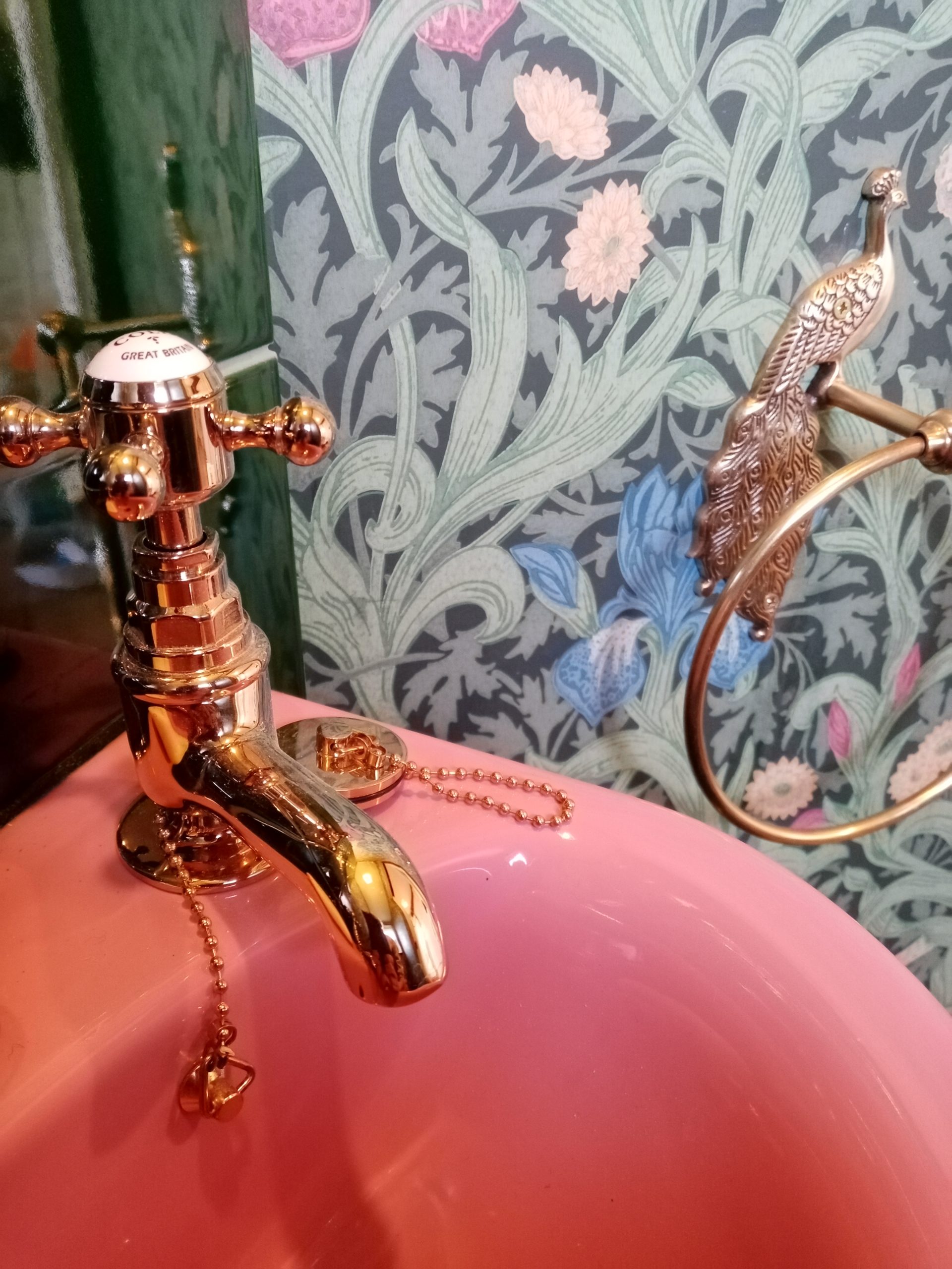
The customers wanted a room to reflect their love of the decorative arts. We settled on a flamboyant Victorian theme.
The customers had chosen a bespoke pink suite. I suggested this William Morris paper with a green marble floor to complement it.
We chose Victorian London Underground HE Smith tiles – laid in a column diagonal to the room to hide pipework. I used a lot of decorative tiles.
We used gold fittings for an extra rich and luxurious feel. The room is a stunning statement and is warm and inviting.
A new cloakroom
The room had been a downstairs bathroom which was no longer needed.
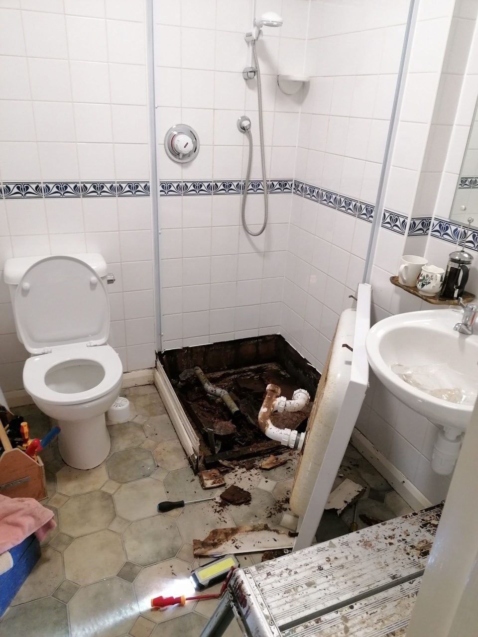
Upon removing the shower tray it was discovered to be entirely rotten.
The customer wanted a utility room but also an elegant cloakroom. Could I combine that?
The finished room is a glamorous surprise. Appliances and utility items etc are hidden behind symmetrical painted doors.
I added shelving to make the room feel maximalist. The tiles are a greenish grey to tie in with the Lucie Annabel wallpaper.
I persuaded the customer to have a big statement light, which she is delighted with as it finishes the room so well.
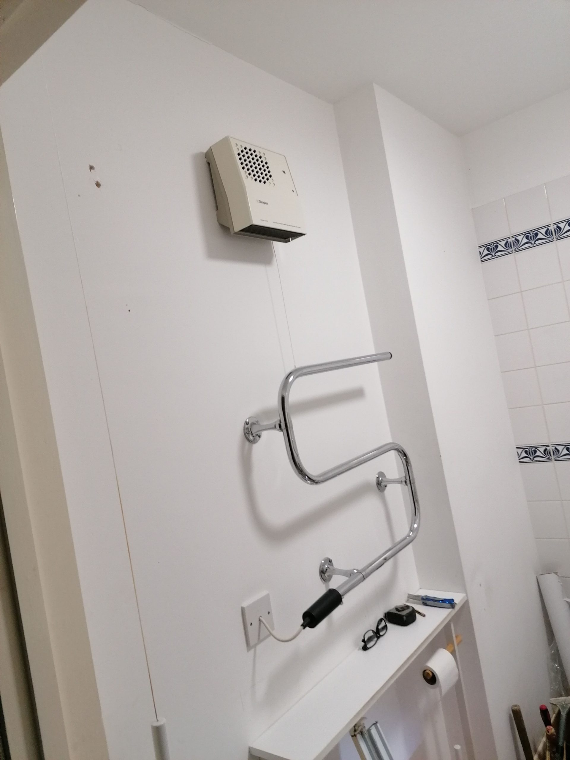
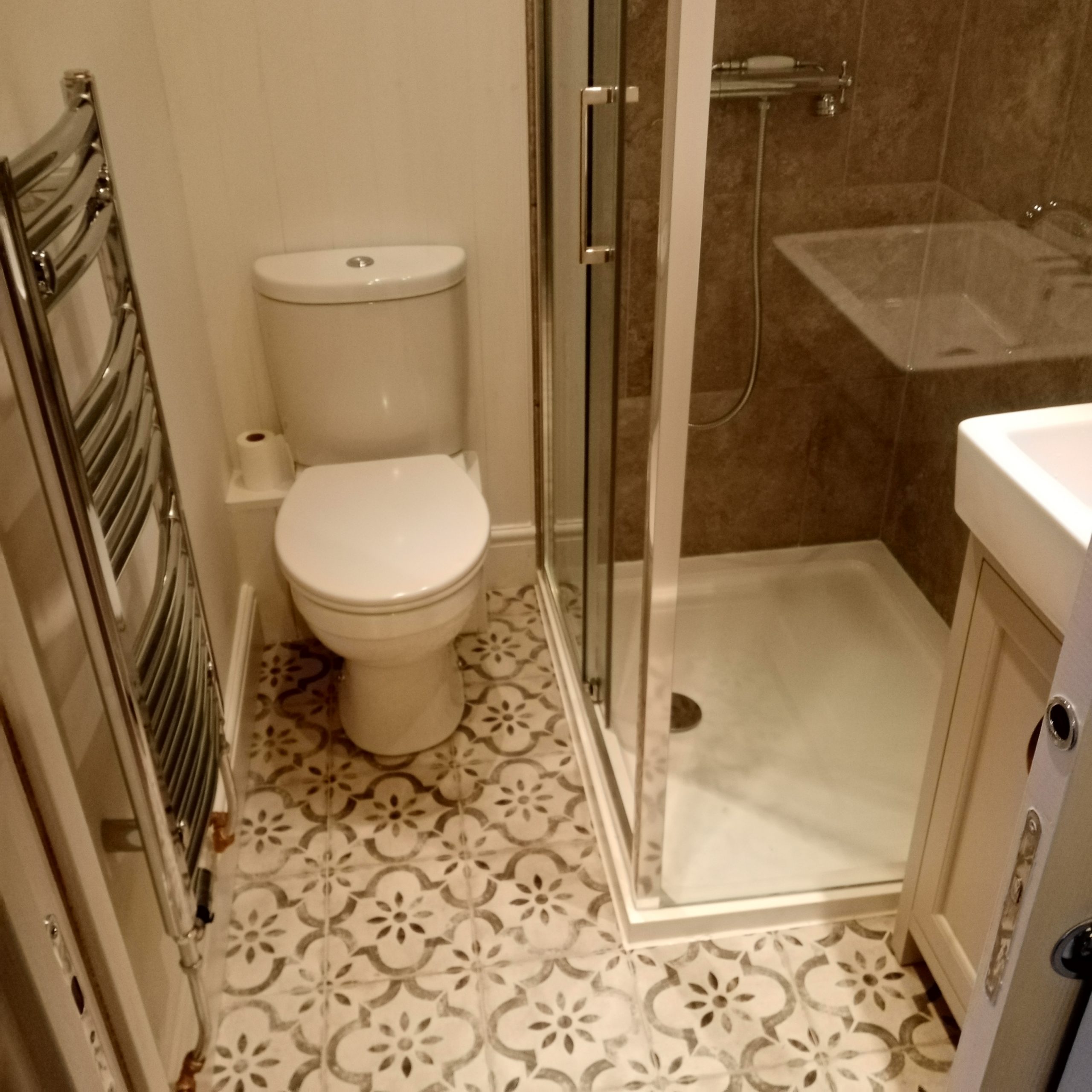
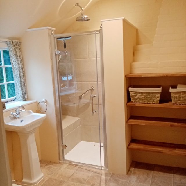
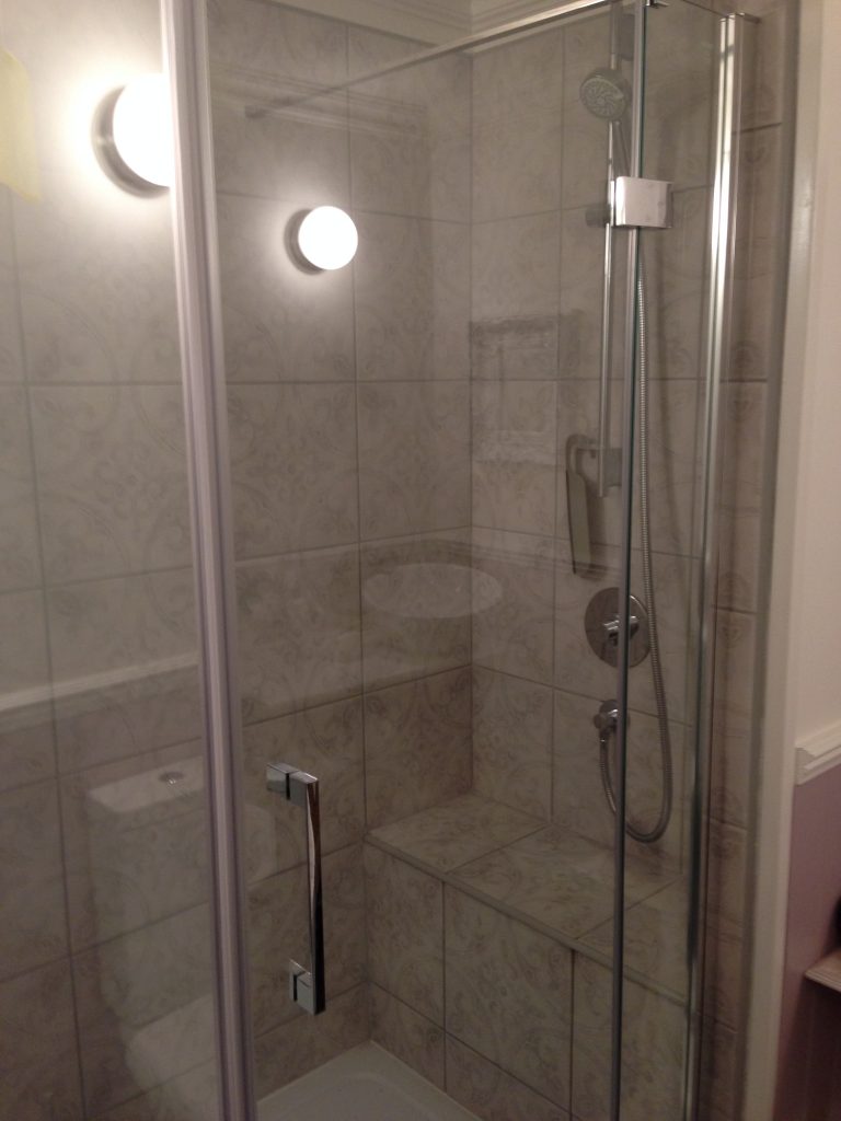
Modernising a shower room in a 1740s cottage
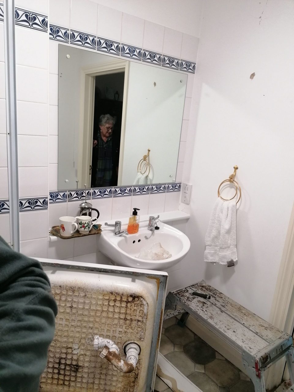
The customer has a lovely cottage with a small, dated bathroom in need of an update. Faringdon Handyman removed everything to start afresh.
The customer initially requested everything in white but I felt that some grey, warm whites, pattern and texture would look more visually interesting.
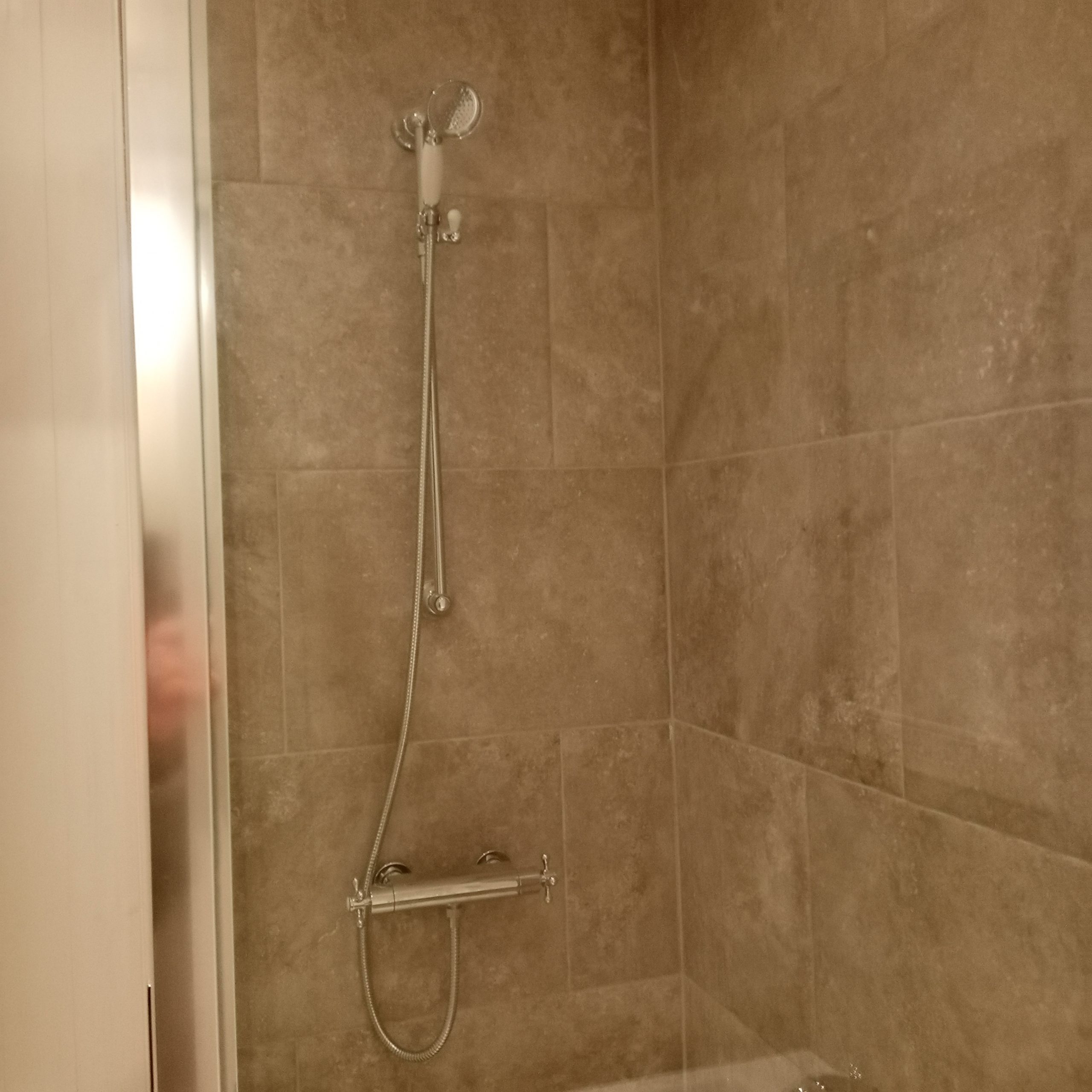
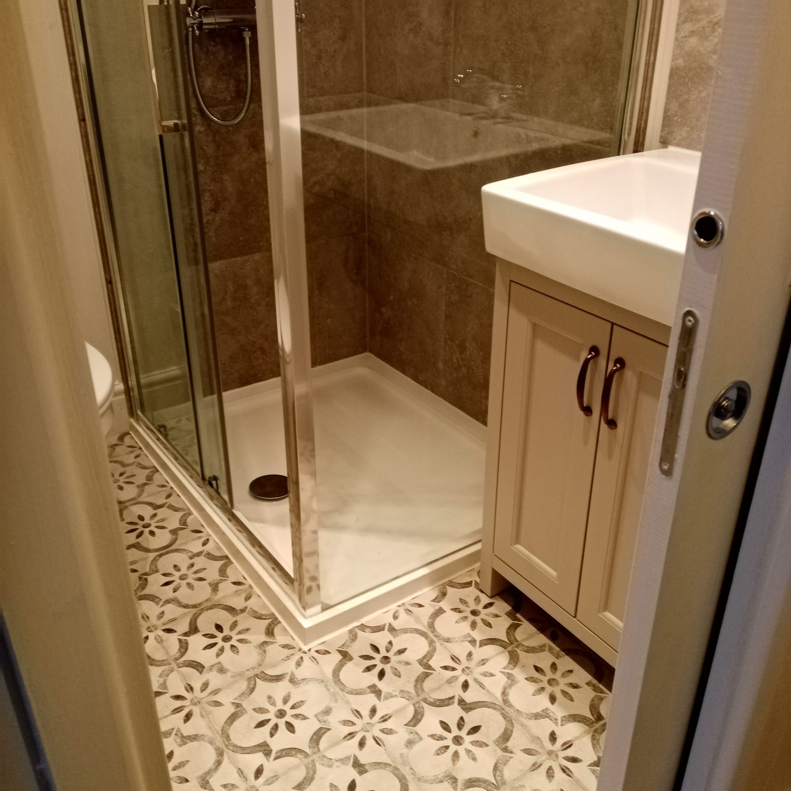
I specified large-scale shower tiles to reduce grout cleaning and make the space appear larger. I used a vintage distressed pattern on the floor to add interest and be in keeping with the age of the house.
The original shower enclosure was a cramped 800mm quadrant. To fit a large rectangular 1000mm enclosure I replaced the swing door with a sliding pocket door.
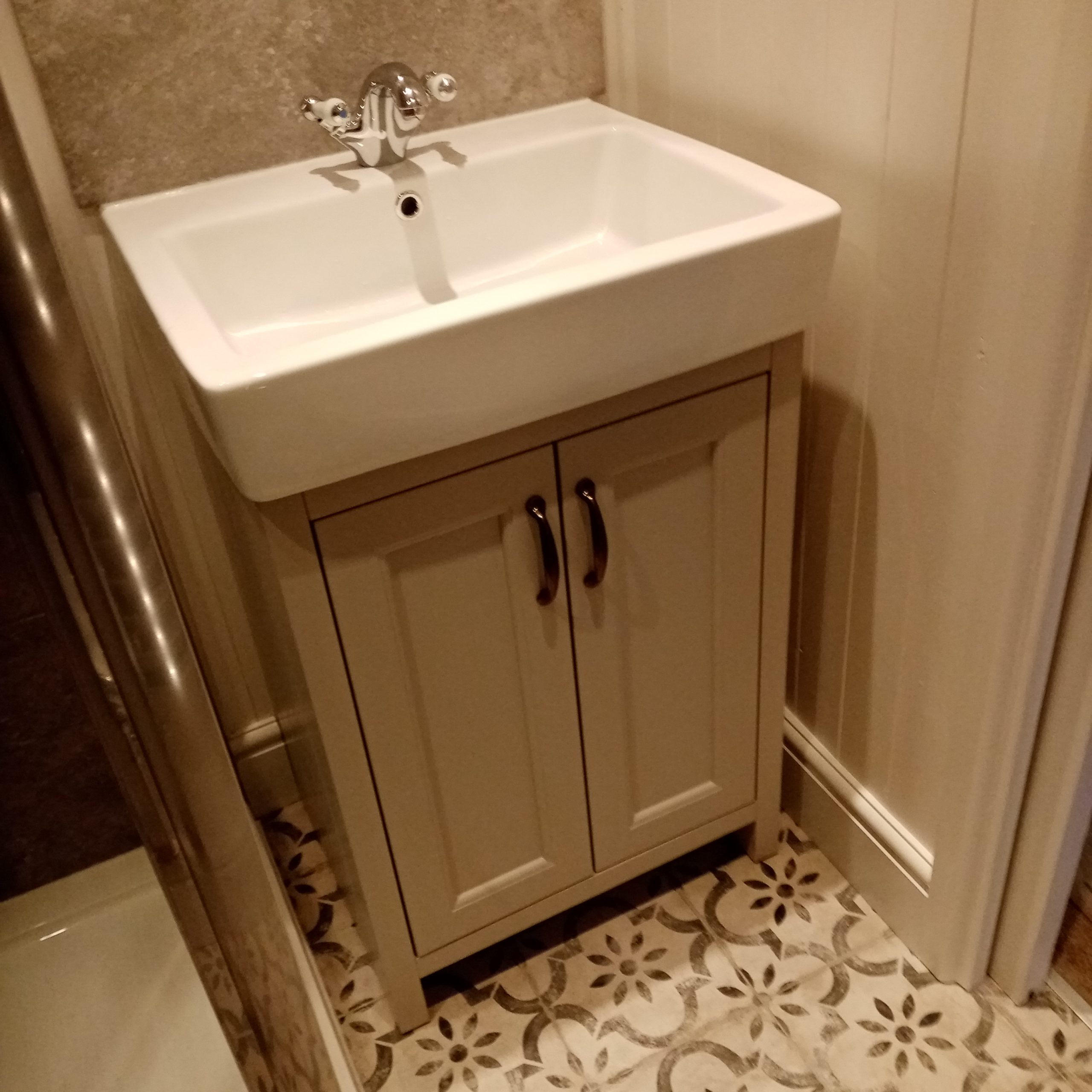
I wanted a large basin but current issues made it hard to find one at the right price, style and colour – after a lot of searching I found just the thing.
The pocket door (by Eclisse) is a wonderful solution in a small space. The photo was taken before I added frosting for privacy. I specified cladding for a period feel.
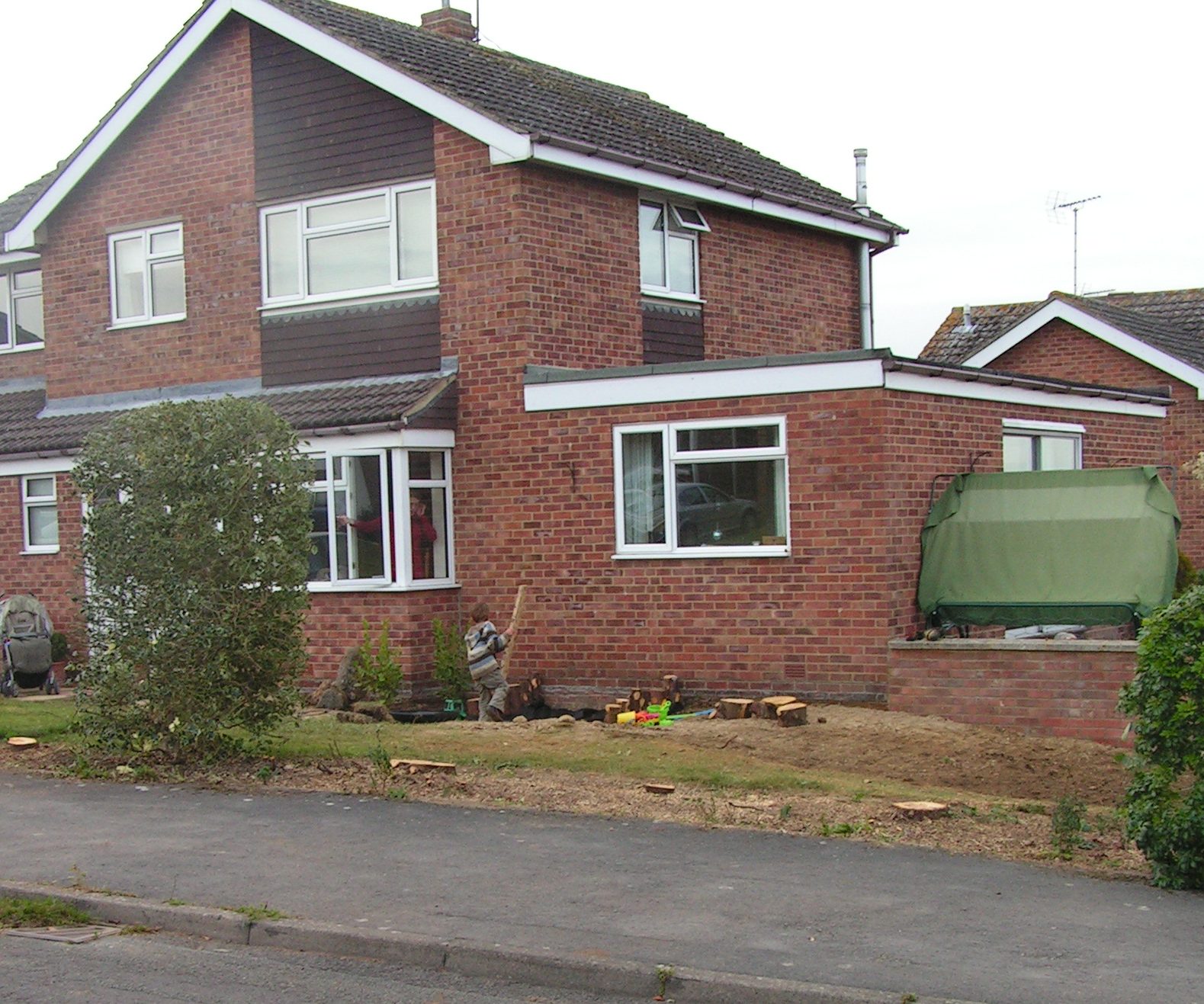
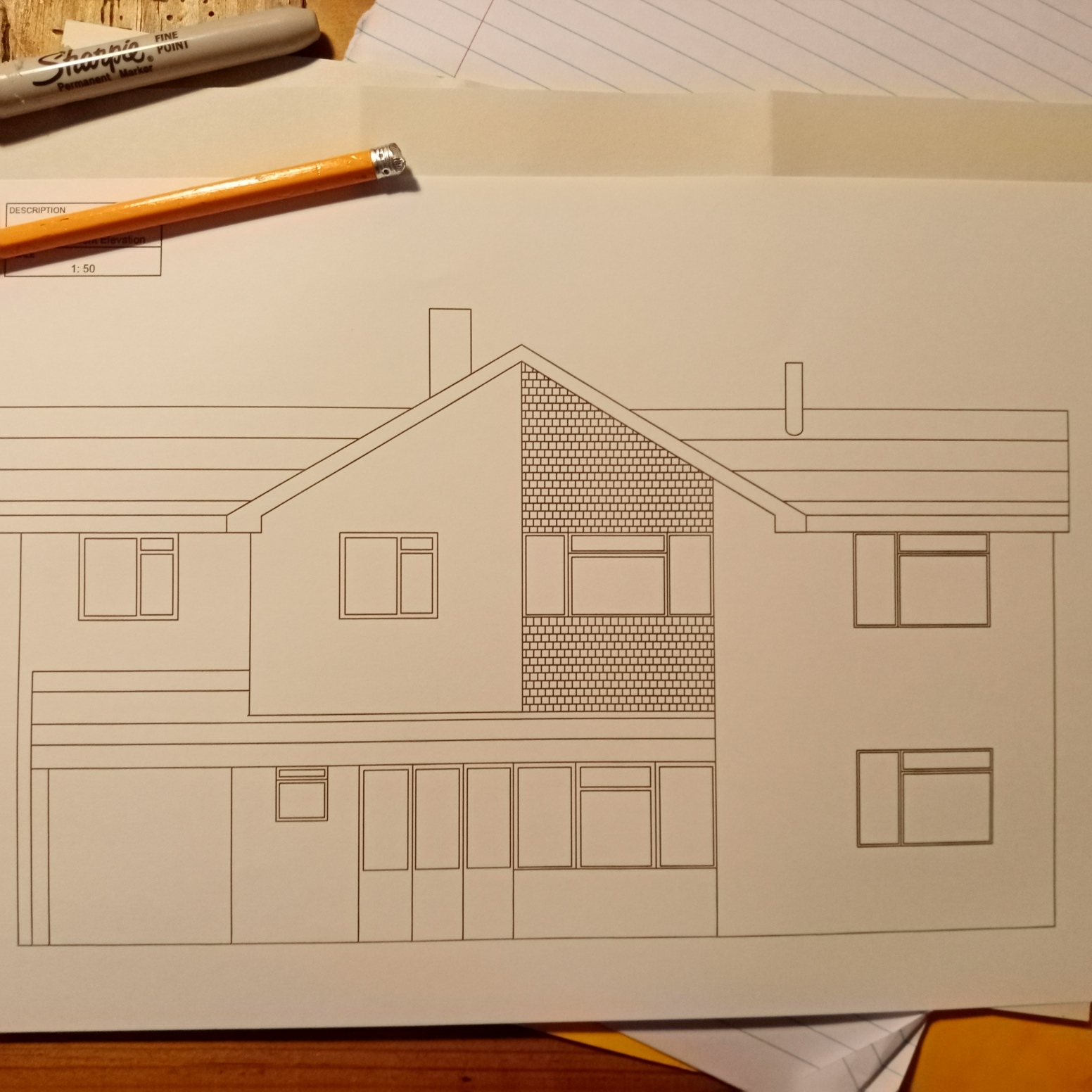
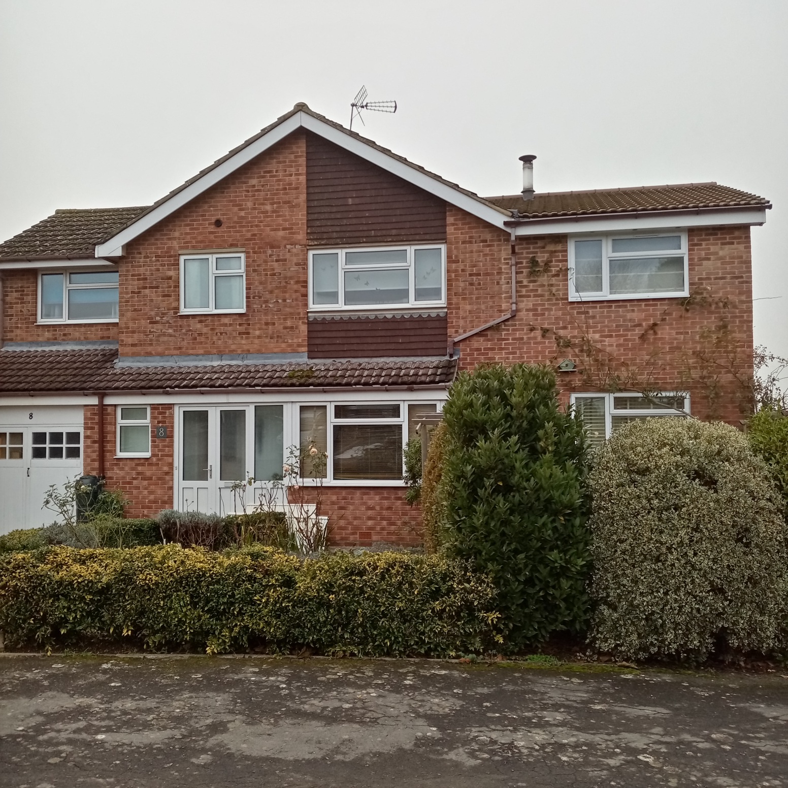
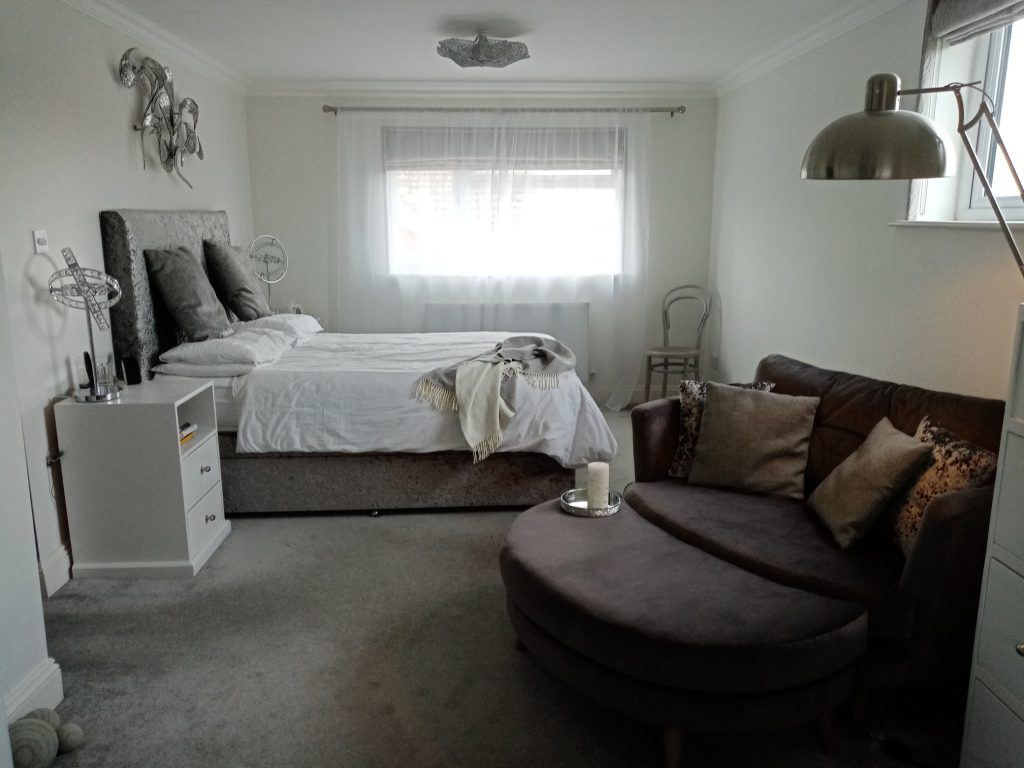
A first floor extension for a new bedroom
This 1978 home had been built with a flat roof uninsulated extension. To increase space I designed a simple first floor extension with a side pitched roof in keeping with the house and street styles.
I drew up location, site, internal and external plans for submission to the Planning Permission department. As it was simple it didn’t need an architect, just a good builder.
Andy Paget and his team did a great job meeting the brick, roof, tile and flue specifications and making sure the build was compliant with Building Regulations.
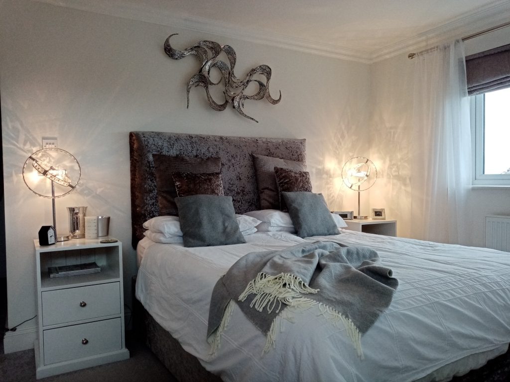
The new bedroom
I chose whites, greys and silvers for this mininalist triple aspect ‘bling’ bedroom. I designed the cabinets, wardrobe, headboard and window treatments.
I fitted a chair and footstool for a luxury feel and to provide quiet space in a busy family home.
Before: the room had not been decorated since 1964 and was a mishmash of items.
Before: the room had an open drain and a vinyl floor which were leading to bad smells and peeling paint.
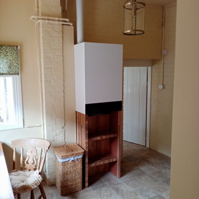
Before: a new boiler had been installed in a very awkward place with a lot of unattractive visible pipework.
After: Roger at Faringdon Handyman built and installed my designs. I had previously reworked the kitchen and chose to use the same colours and style for continuity.
After: I designed the room to have a large worktop with waterfall side) and a shoe and wellington rack created from worktop.
After: I hid the pipes with bespoke removable shelving and added a hurricane lantern and William Morris blinds.
An accessible shower room for the same customer
The scullery had a separate loo and shelving overhead which made it seem cramped and dark.
After: The only radiator was in here so the owner used the loo to dry clothes. The gas installers had put visible pipes here too.
The 1920s scullery was small and fitting in a shower was constrained by the chimney and existing drainage.
The ceiling was falling down, there was no insulation and the floor had been incorrectly installed leading to damp.
After: Roger at Faringdon Handyman demolished the loo walls, creating a larger room, and carried out all the main works and installations.
After: The pipes were boxed in and I chose traditional fittings to complement the Victorian property. Curtains add warmth.
After: I designed a shower with inbuilt seat and hand rails for my less mobile customer, who wanted easy access shelves.
After: I raised the floor to make one level and put in a chair to aid mobility. I added insulation and ventilation to avoid damp.
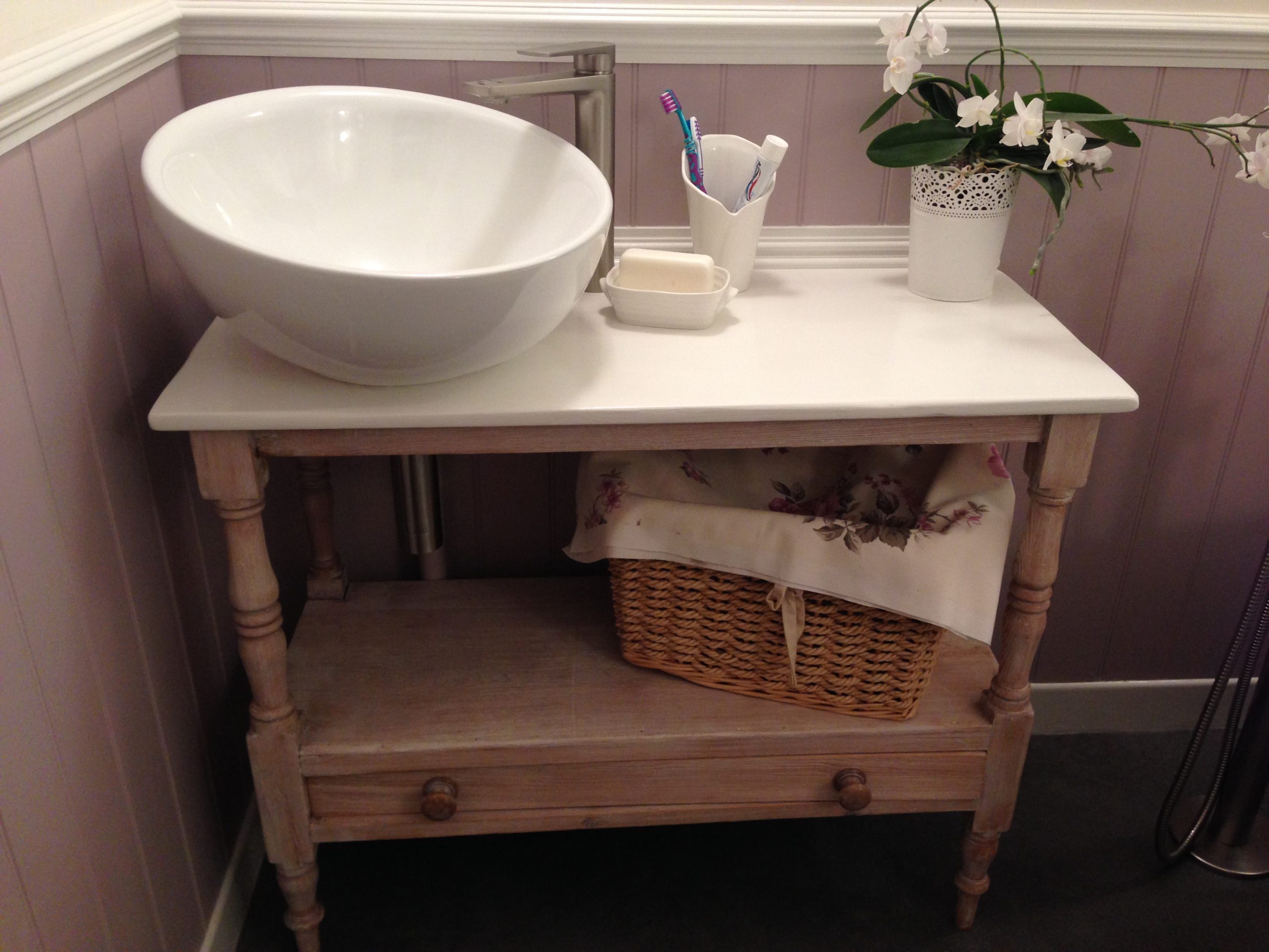
A new bathroom
A tiny bedroom became a new bathroom, requiring new plumbing, soil, lighting and flooring. The style was to be feminine, slightly French and vintage inspired.
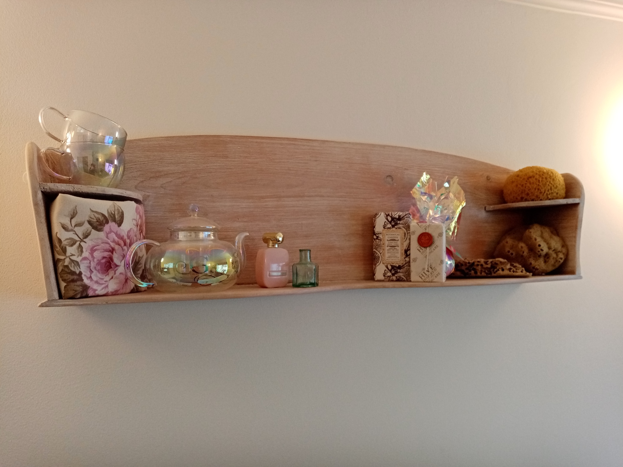
I couldn’t use the top of this original French washstand as it had a hole for a pitcher and ewer; so I repurposed it as a wall shelf.
Thoughful planning enabled me to fit in a bath, a shower with a seat, an airing cupboard, a sink and a loo.
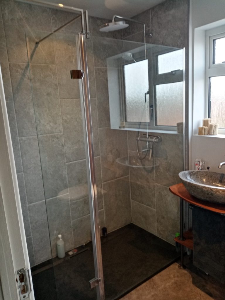
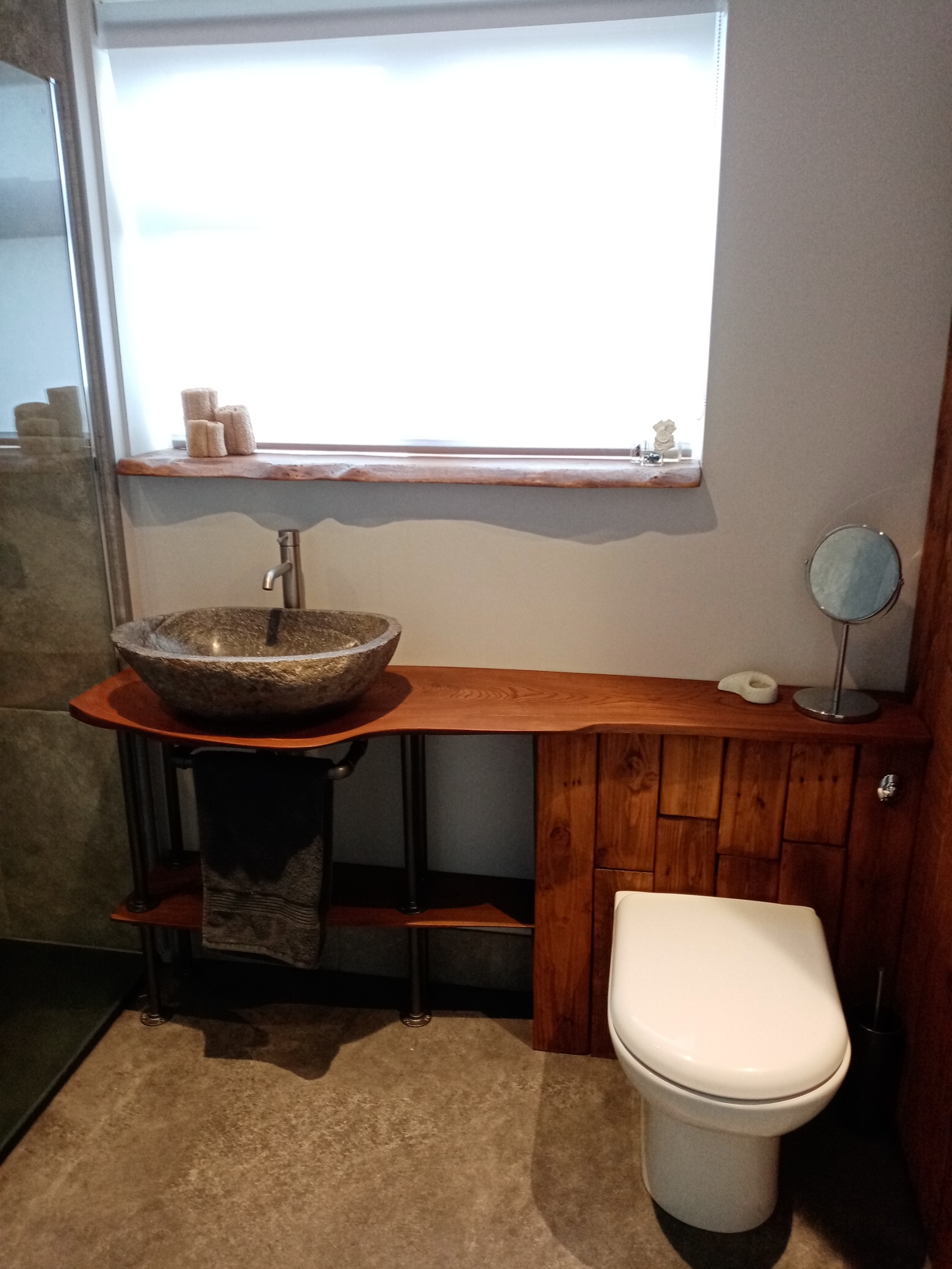
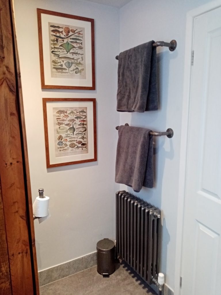
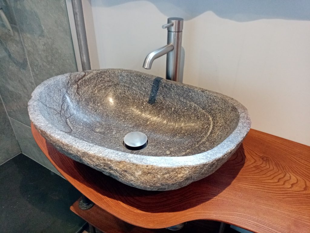
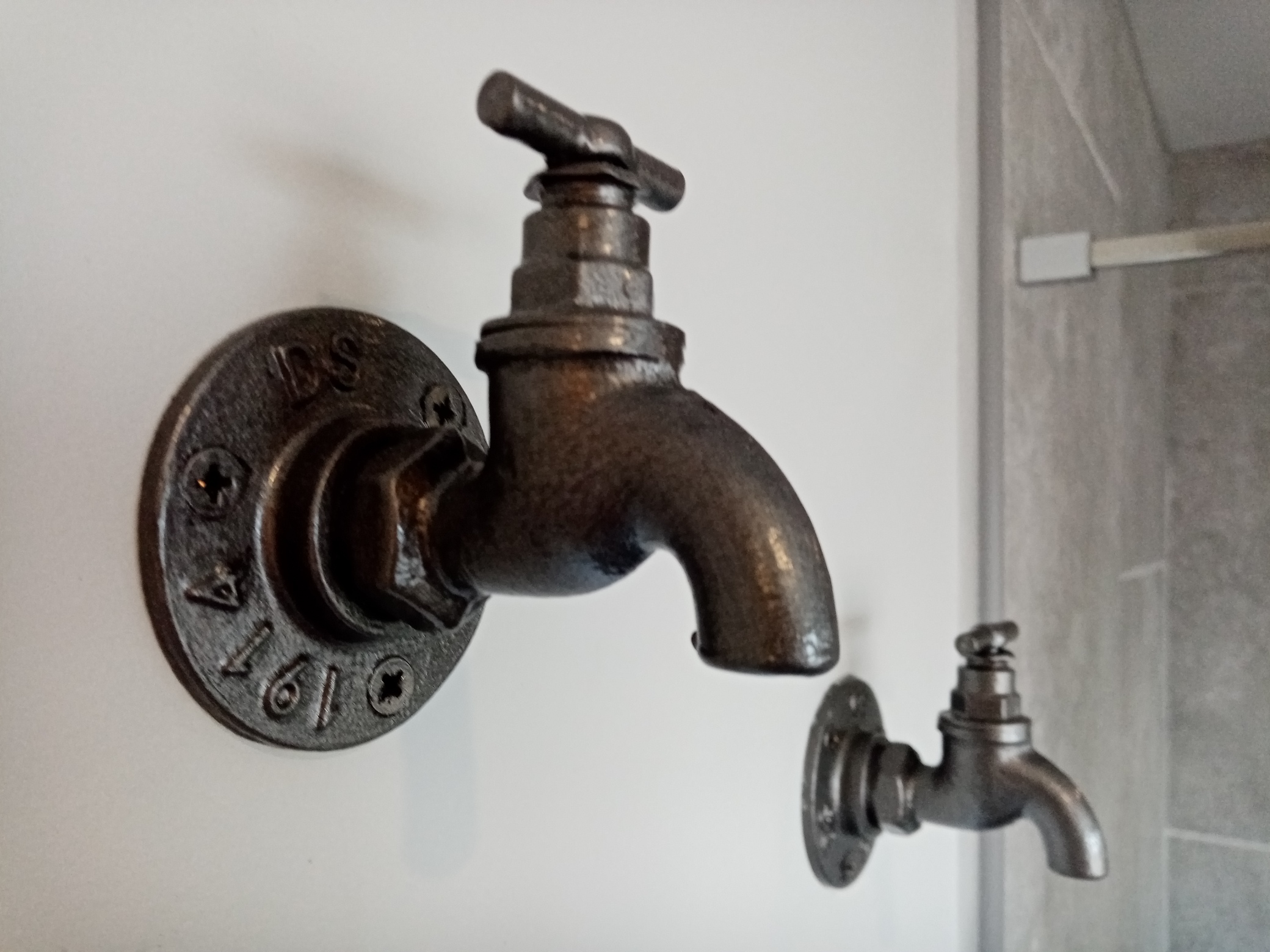
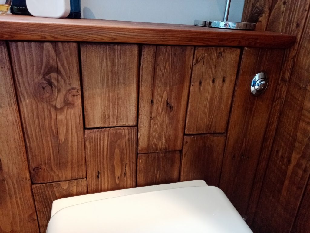
A new industrial/earthy bathroom
The new bathroom replaced a dated 90s one. The bath came out and was replaced with a walk-in shower with rainfall showerhead.
I wanted to have a unique worktop and spent time sourcing a single slab of wood; I used elm for its water-resistant properties.
I chose to reuse pallet wood for the cupboard, sanding. staining and oiling each (very long) piece. The radiator is bespoke.
The statement sink is a boulderstone set simply on the solid elm countertop. It complements the ‘natural earth’ feel.
All the pipework is industrial steel coated in Hammerite. The whimsical taps form towel hooks while showering.
The wood detail works so well and – for practical reasons – allows access to the cistern.
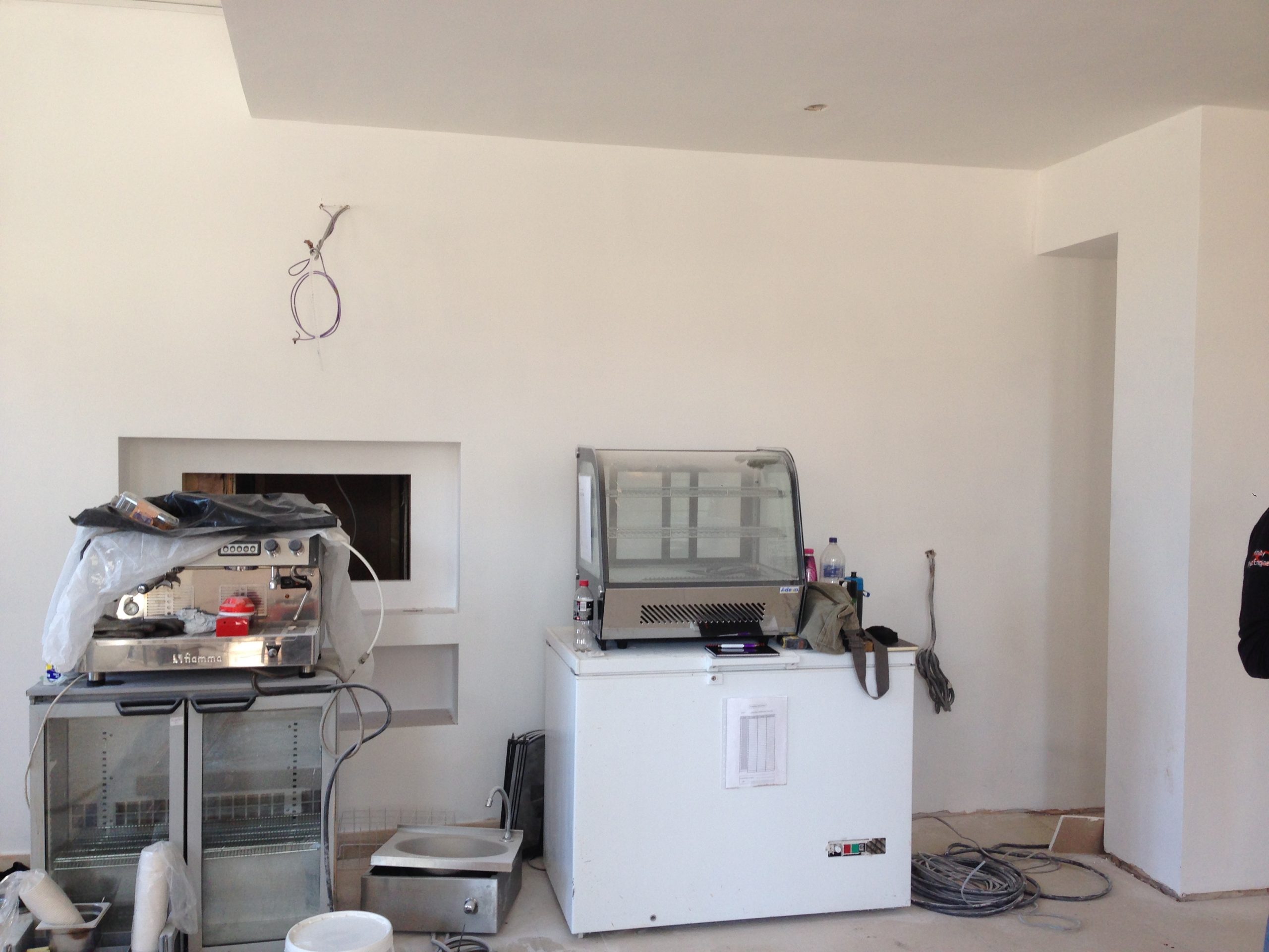
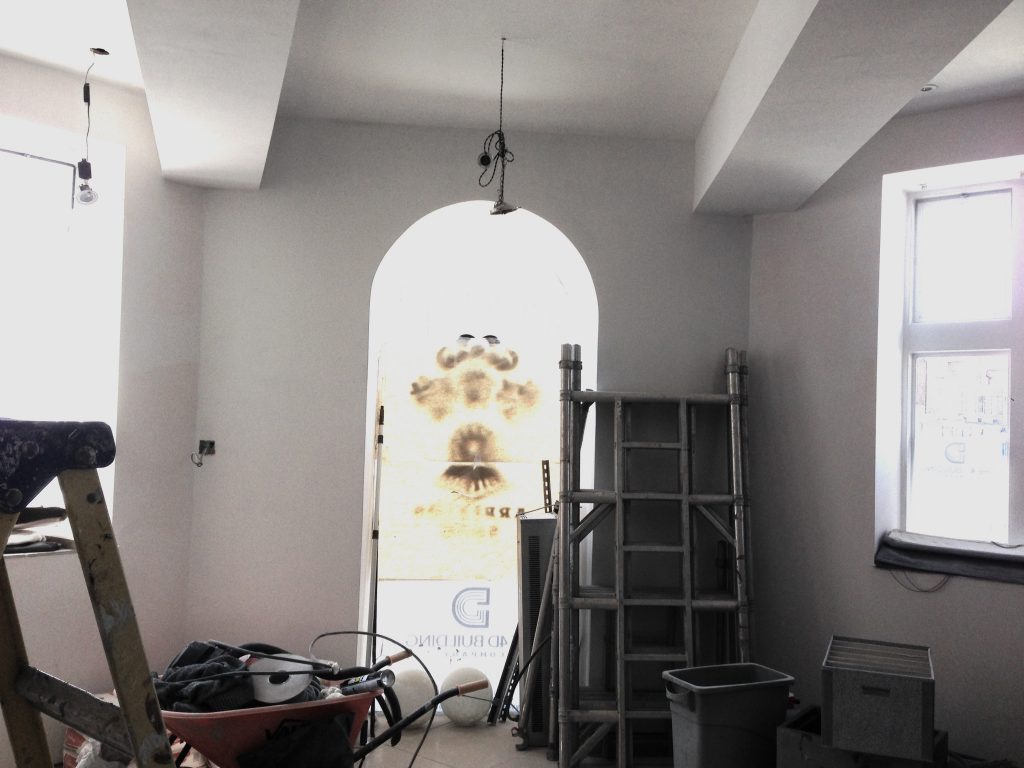
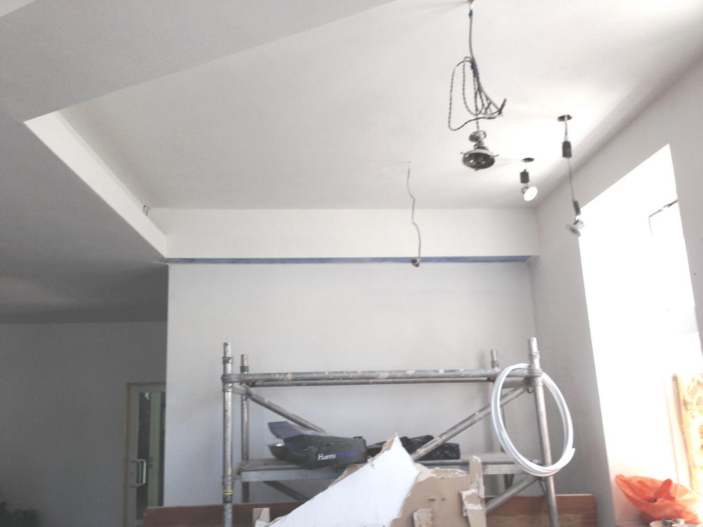
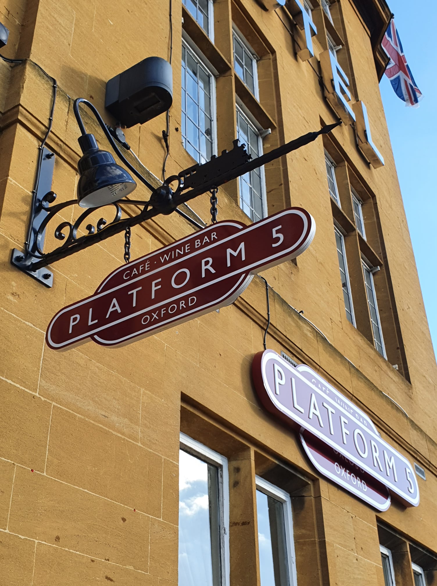
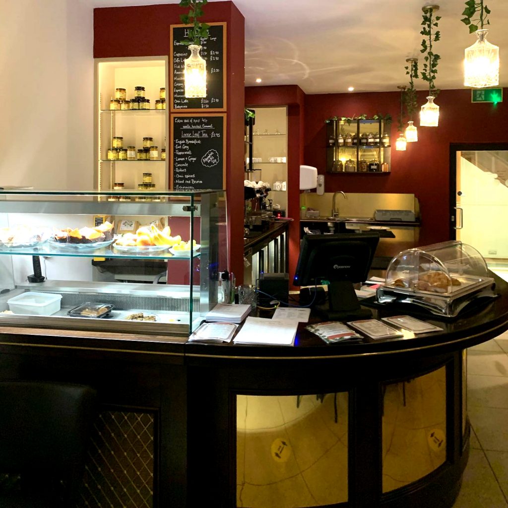
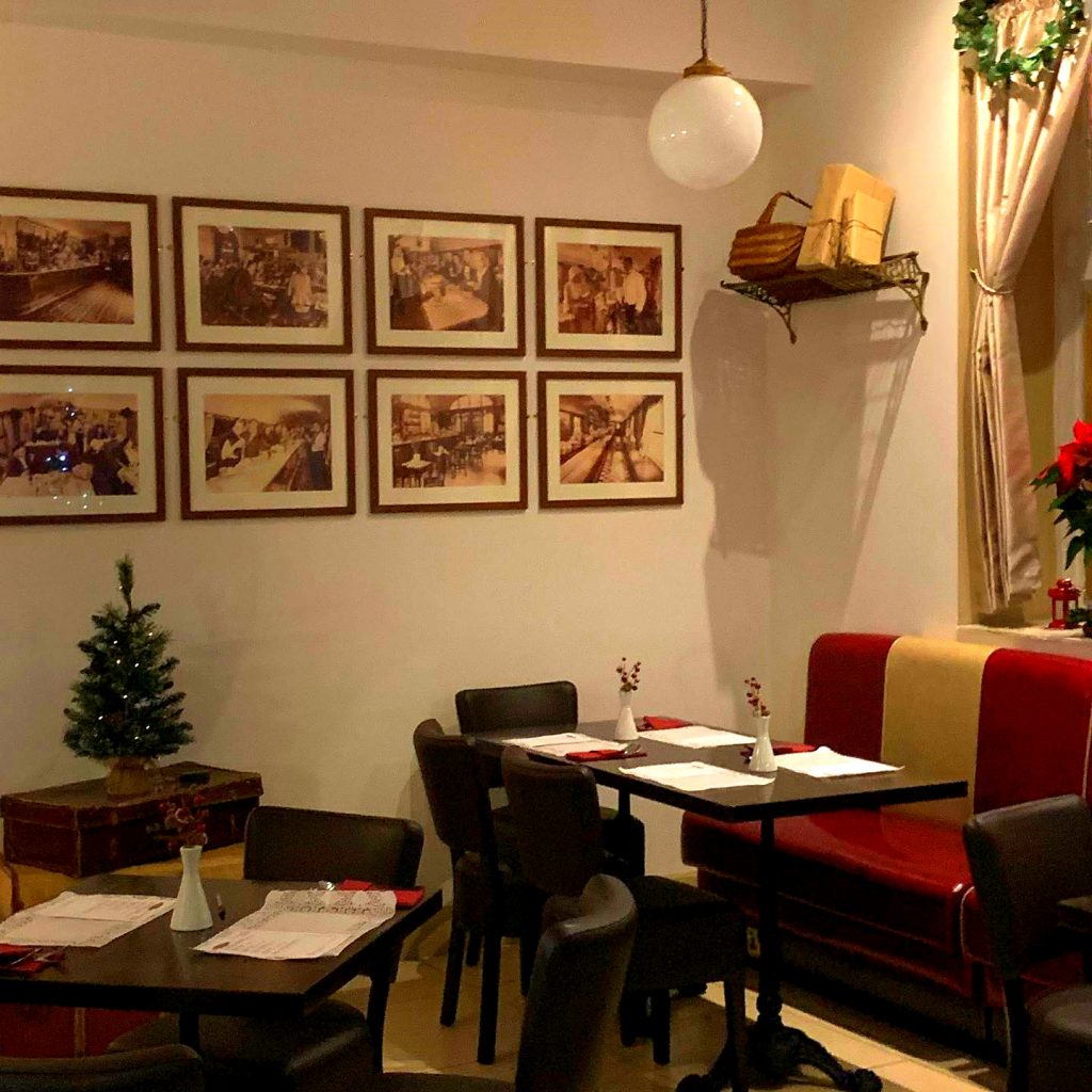
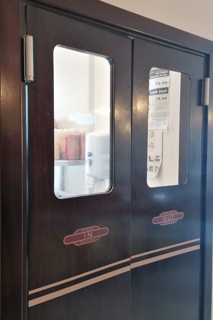
Platform 5 Oxford, a historically themed cafe (now The Olive Tree)
I was asked if I could urgently help with a cafe redesign in March 2020 after the new owners had sacked the previous designer. The building was a partly completed shell.
The owners wanted a space to serve hotel breakfasts, morning coffee, light lunches, evening meals and then to be a cocktail bar in the evening…a wide remit.
The room’s shape and size was awkward, as were the ceiling and wall recesses, window shapes, entrances, exits, tiny kitchen and the macerating toilet.
I designed the logo, branding and overall style – as the cafe is next to Oxford’s station, I chose “glamorous 1930s railway cafe”.
I wanted to reflect an opulent ambience so chose dark reds, champagne golds, brass and dark wood for a look that worked by day and by night.
I chose historical images of railway cafes, used vintage Oxford-related travel posters and installed railway luggage racks complete with luggage.
I designed kitchen swing doors in the shape and style of vintage carriages with the hamburger logo, double line detail and rounded windows.
I enjoyed designing the bar, sales and storage areas, creating rounded ‘vintage mahogany’ style cabinetry with a mirror brass backing.
Attention to small details like the brass stripe around the bar brought the scheme together cohesively.
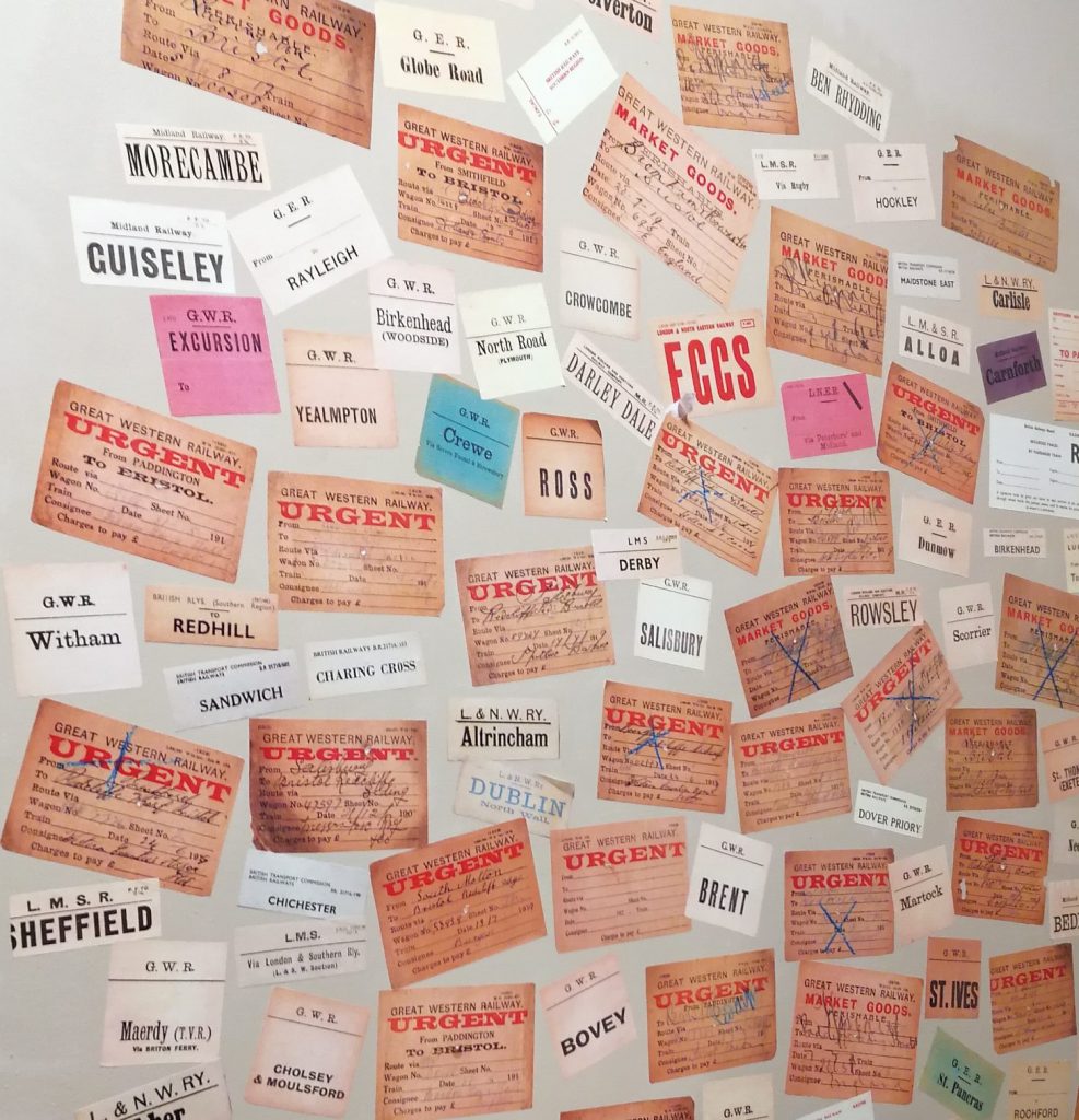
I bought and copied historic luggage and ticket receipts to brighten up the wall in the cloakroom.
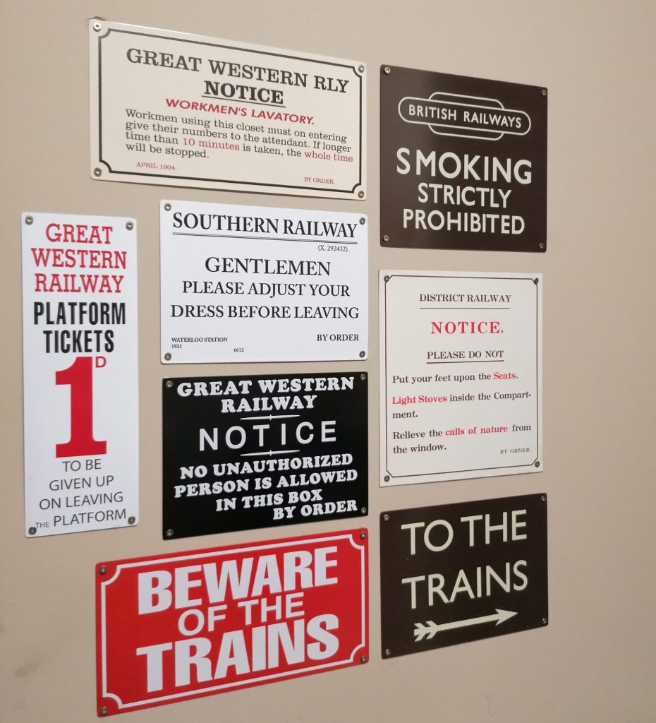
I also purchased copies of historical rail notices for the cloakroom to add interest on a very tight budget.
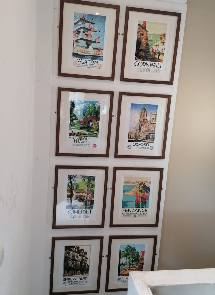
To decorate the empty stairwell I chose vintage posters in matching frames for coherence.
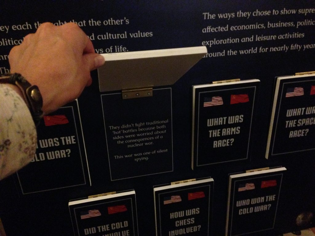
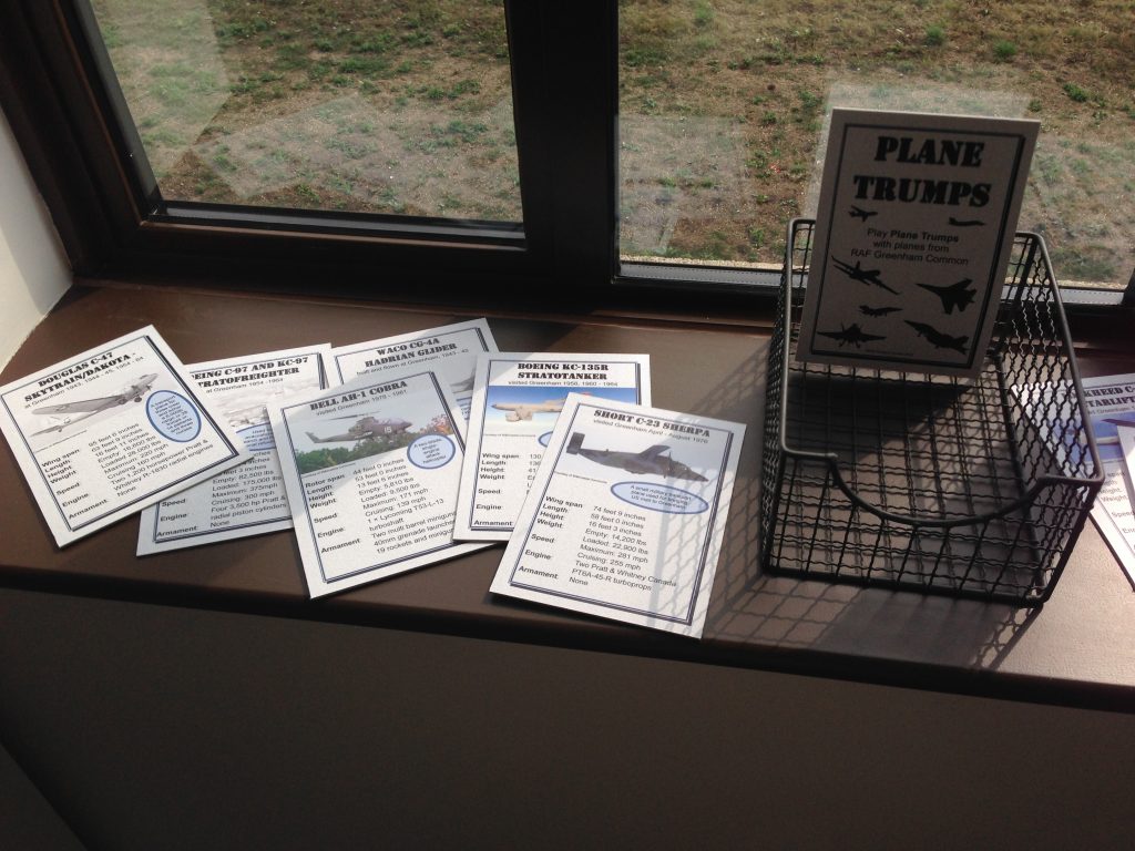
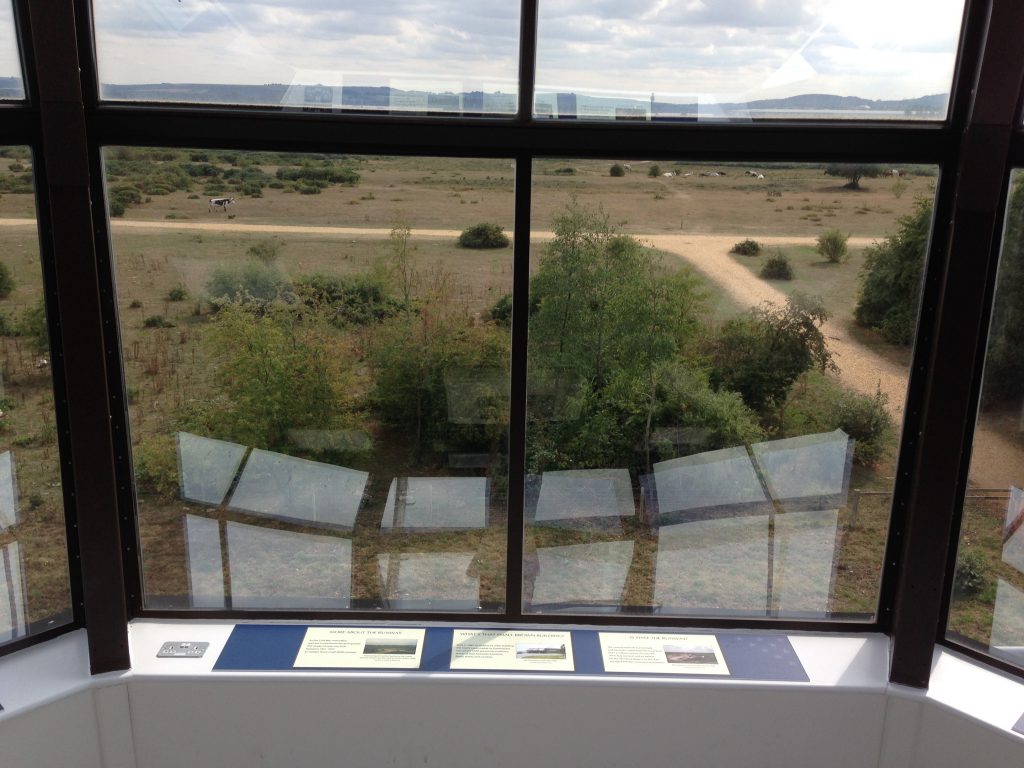
Three exhibitions at Greenham Common, Newbury
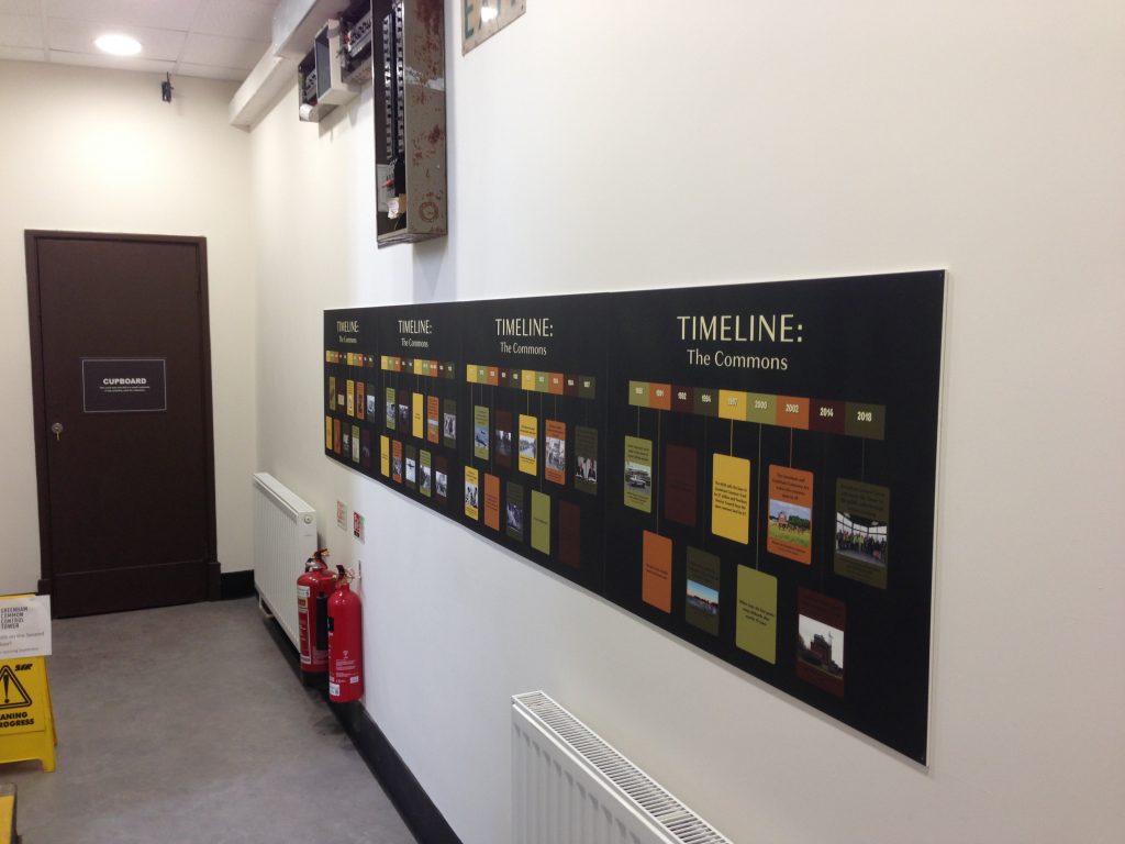
I chose to use a timeline to interpret events at the site since prehistoric times, choosing earthy colours from the nearby heath.
In all the rooms I chose to use similar fonts, layouts and colours to those used by originally by the RAF to give a historical feel.
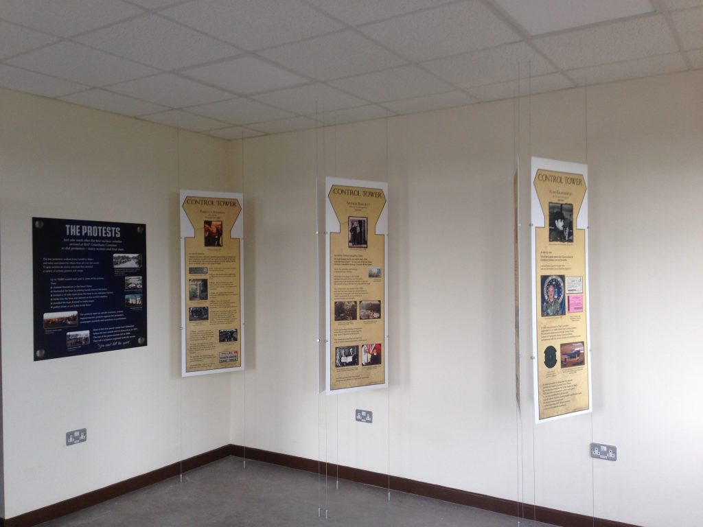
I used the shape of the building’s control tower for hanging panels, which I used as the room was otherwise bare.
To make a Cold War exhibition interesting for all visitors I added lift-the-flap interactives.
I researched, wrote and designed a ‘Top Trumps’ style card game about the planes at the Base.
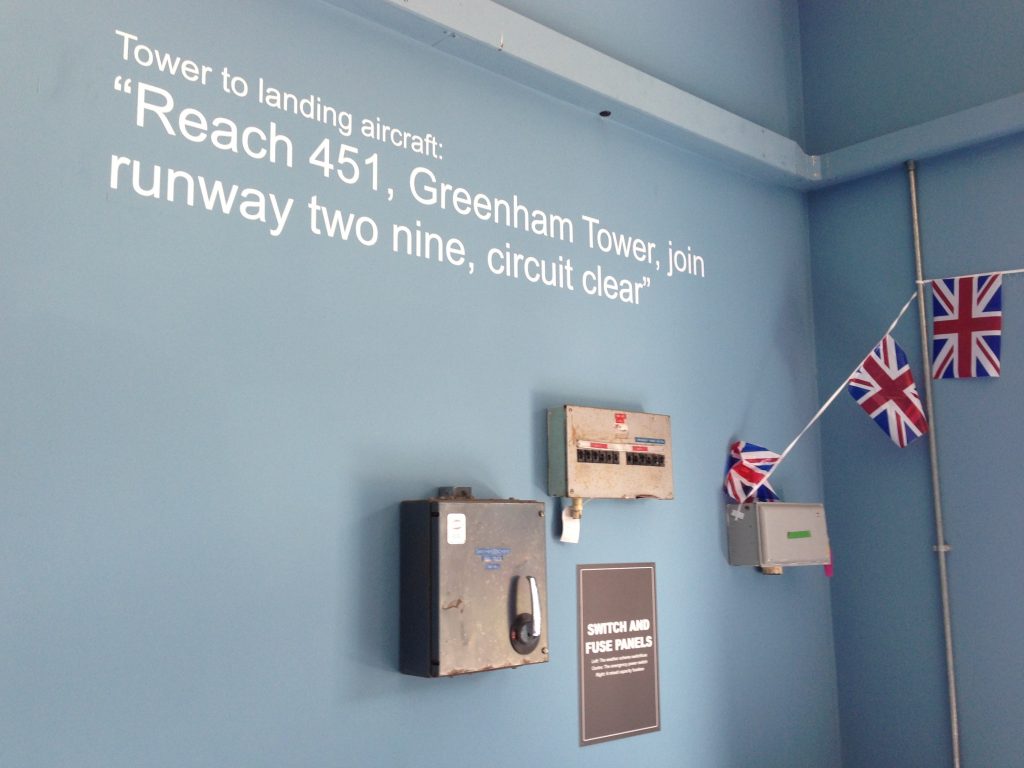
Inspired by the views, I made photo panels showing what the RAF air traffic controllers would have been looking at.
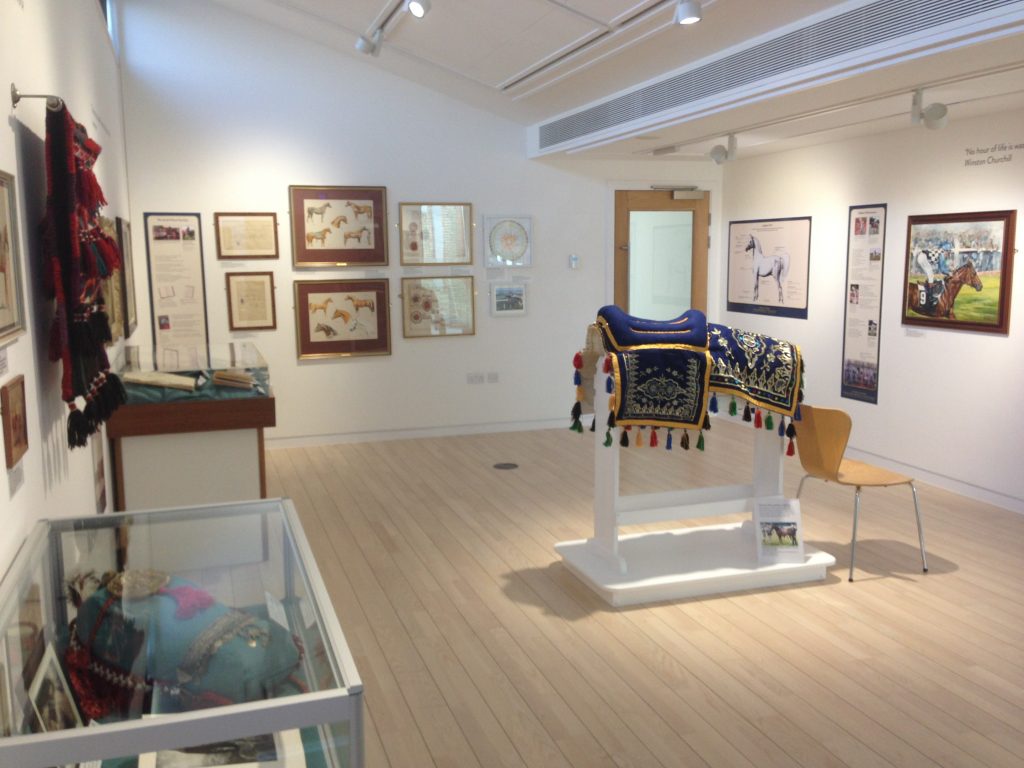
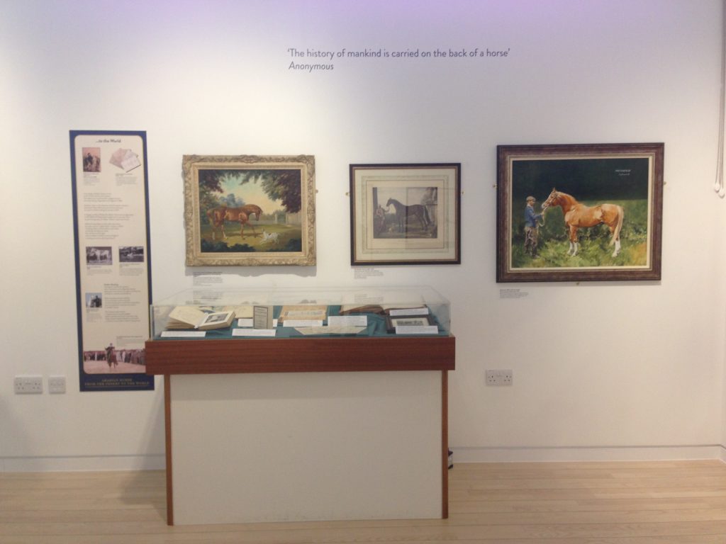
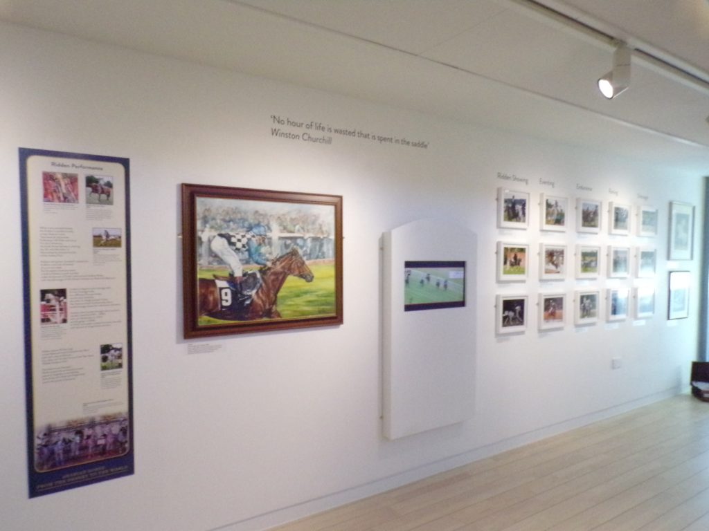
"Arabian Horse" at the National Horseracing Museum, Newmarket
Working on behalf of the Arab Horse Society, I researched and put together a colourful three-part exhibition for their centenary celebrations.
With items from many lenders in differing mediums over two locations there were interesting design and logistical challenges…
….the greatest of which were the audiovisual media, the feature wall of perpendicular matched photographs and designing a saddle rack.
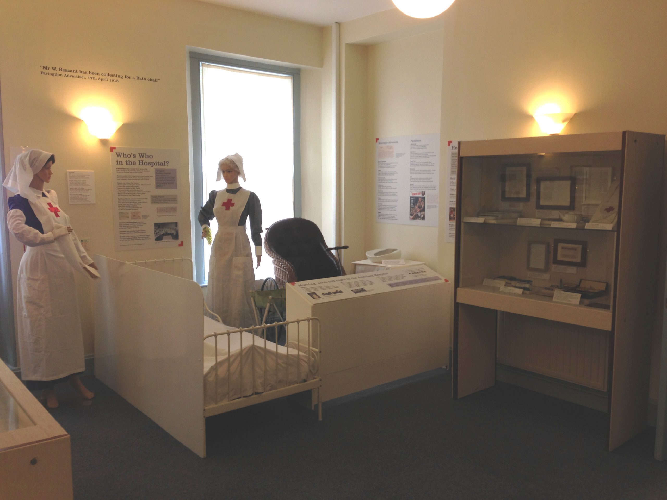
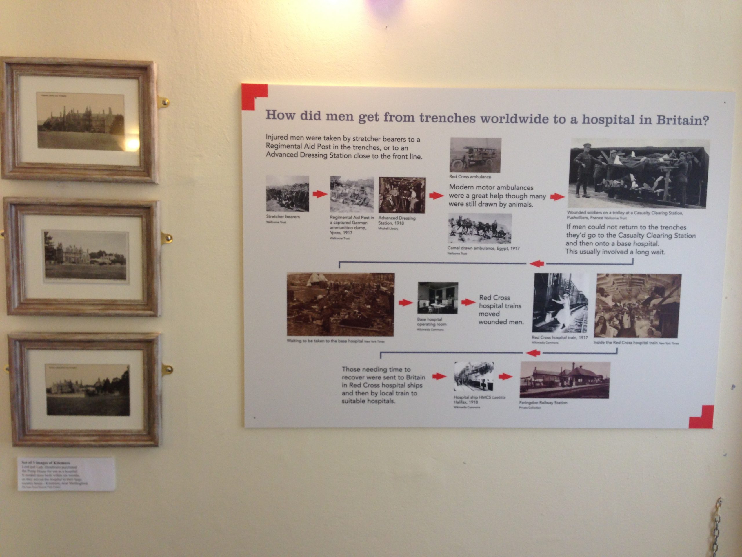
"Hospital", an exhibition at Faringdon Museum, Faringdon
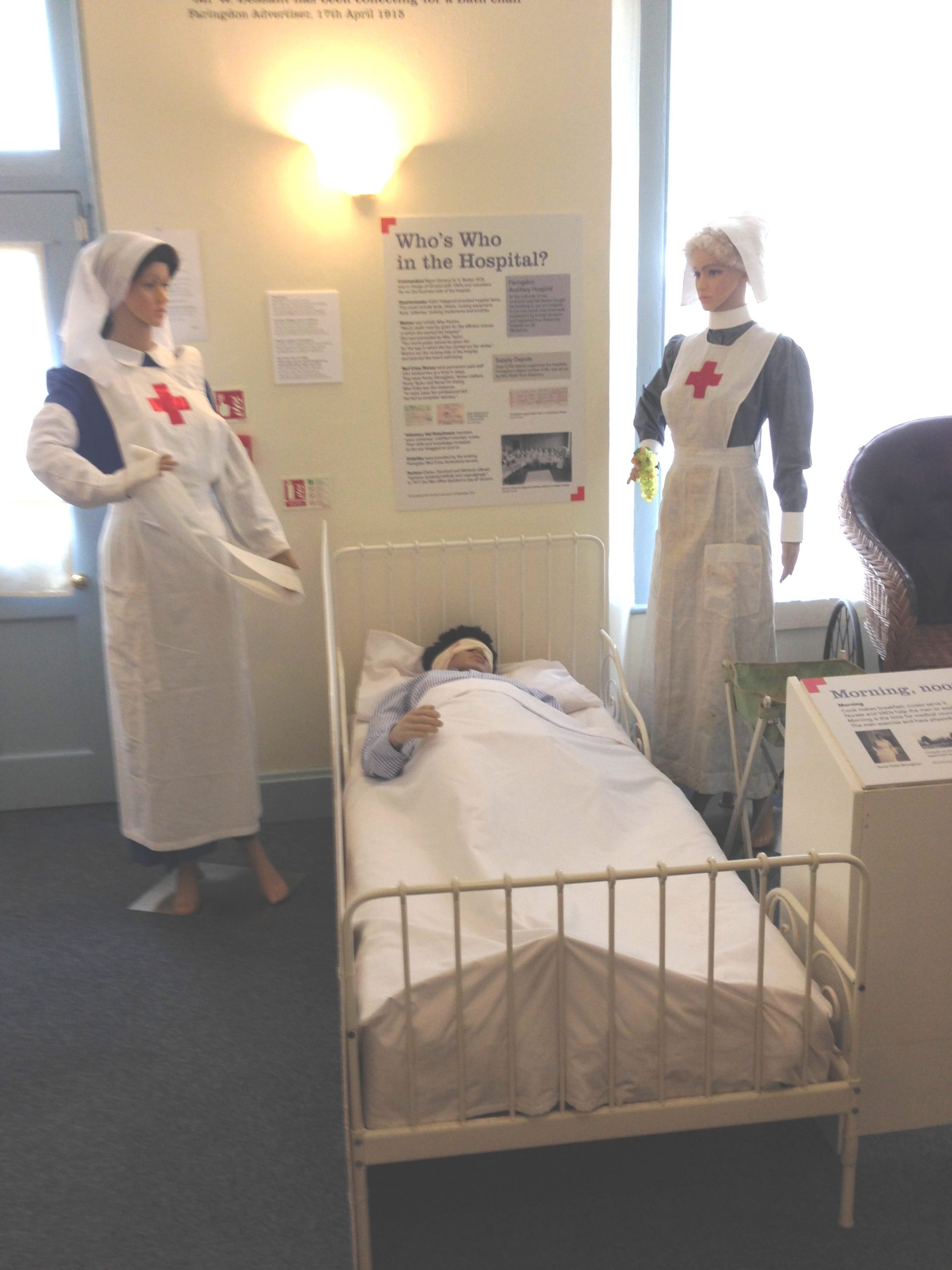
I chose to use mannequins to illustrate the building’s use as a Red Cross hospital in WWII.
The historic building constraints were a design challenge which I overcame creatively (disguising the huge internet server as a hospital table?!).
I recreated the scene with a mix of modern replicas and original clothes and artefacts.
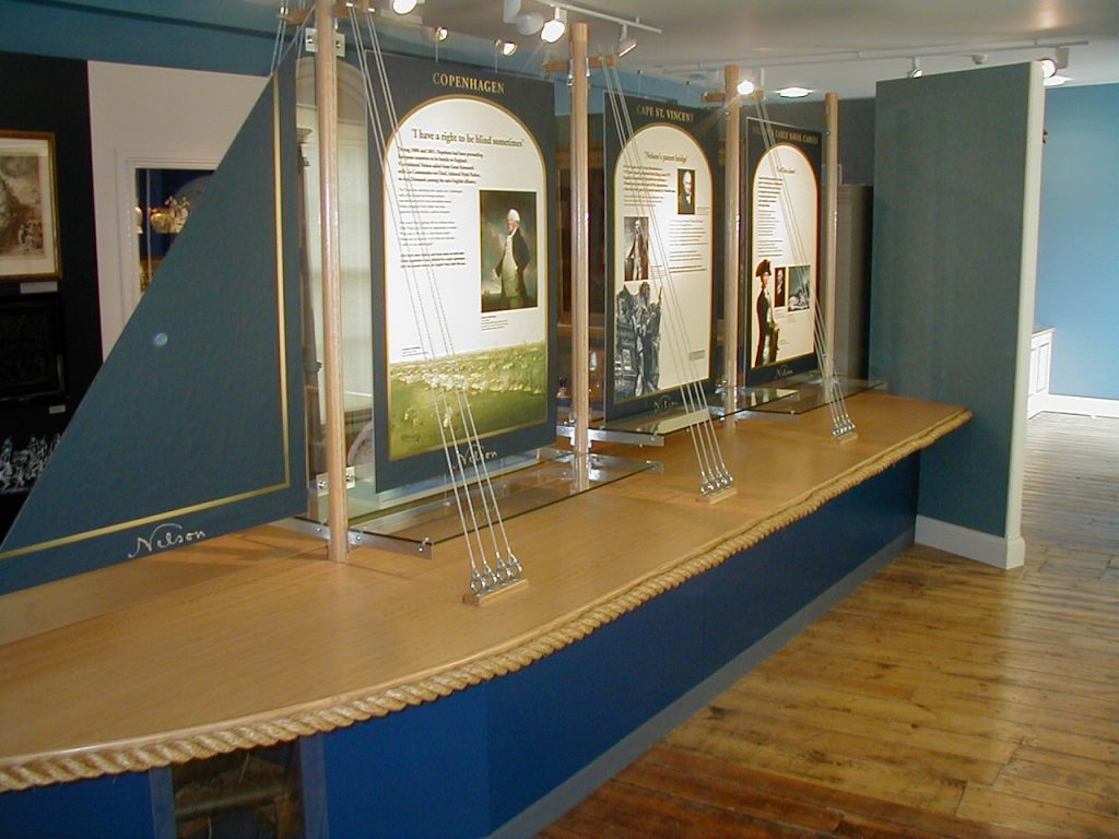
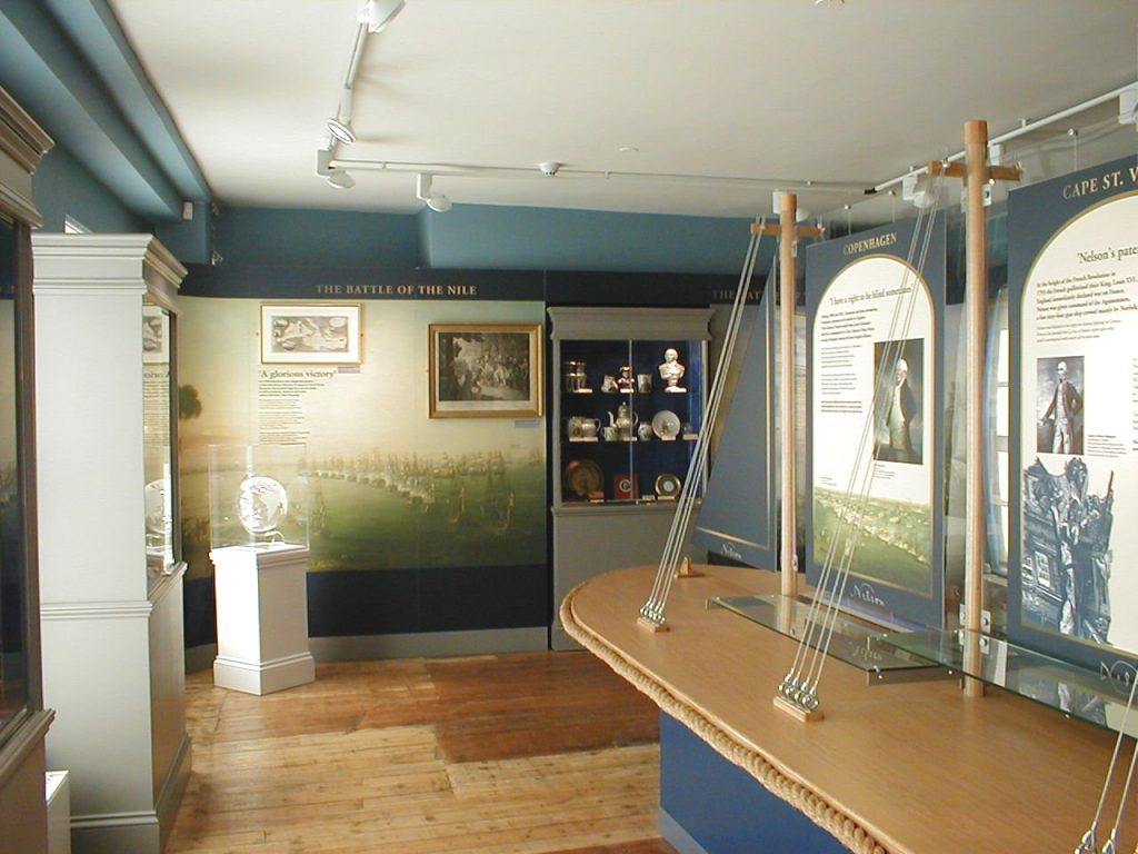
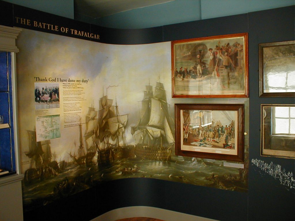
Naval Room at the Nelson Museum, Great Yarmouth
Working with another design team, we chose historical colours and features for the room and ‘boat’.
We used full height panelling and graphic wraps to disguise awkward building features.
I combined the graphic wraps with text and original framed images to create lively displays.
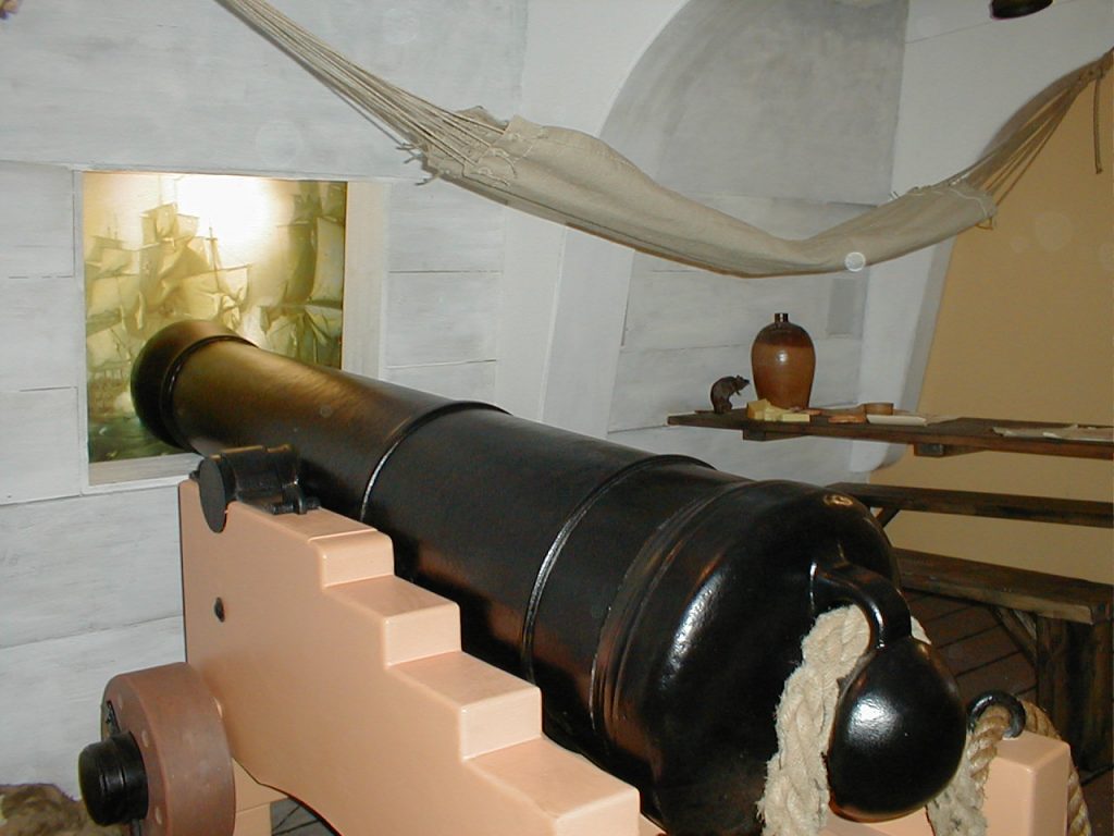
"Below Decks" at the Nelson Museum, Great Yarmouth
I wanted to move alway from traditional ‘items in a display’ and have an interactive area.
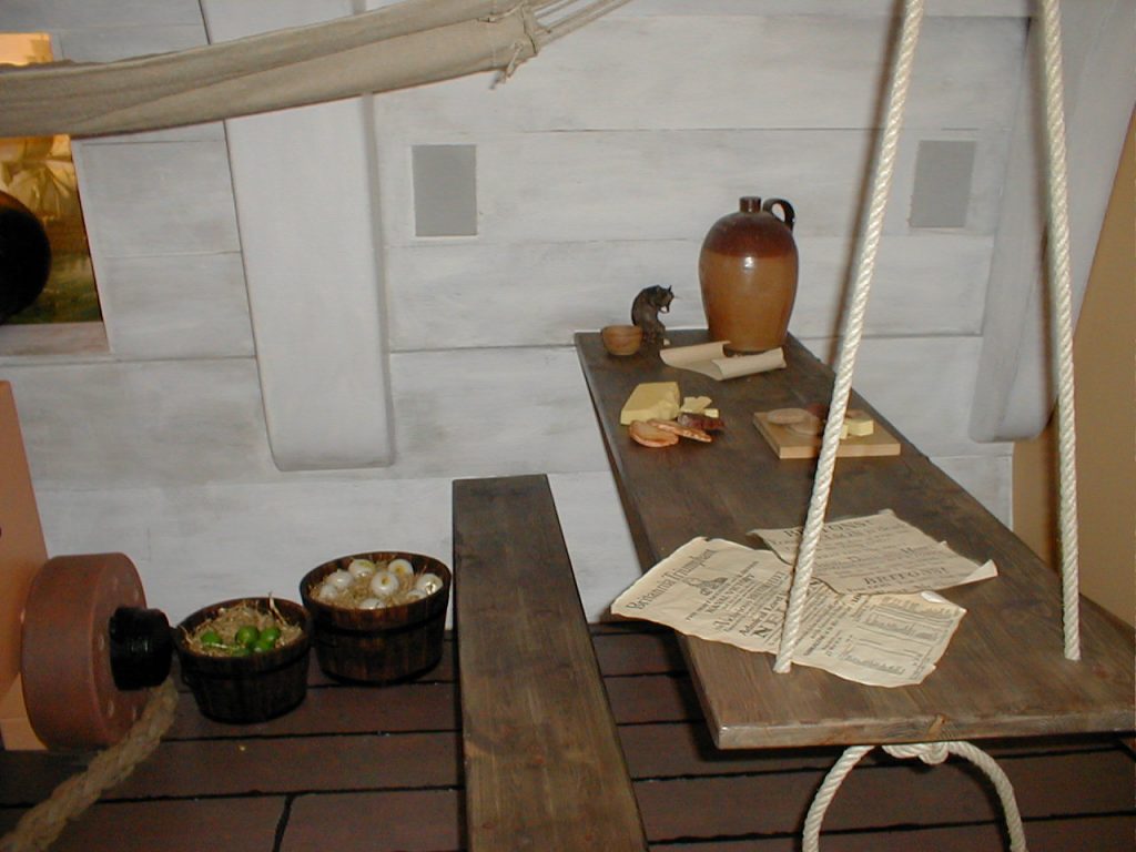
Visitors could sit on the mess benches, feel the rat, play with the food and hear the cannon roar.
We chose six ranks of sailor and told their colourful ‘stories’ through interactive means.
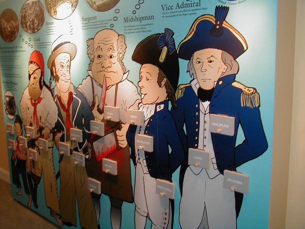
"Man the Guns" at the Nelson Museum, Yarmouth
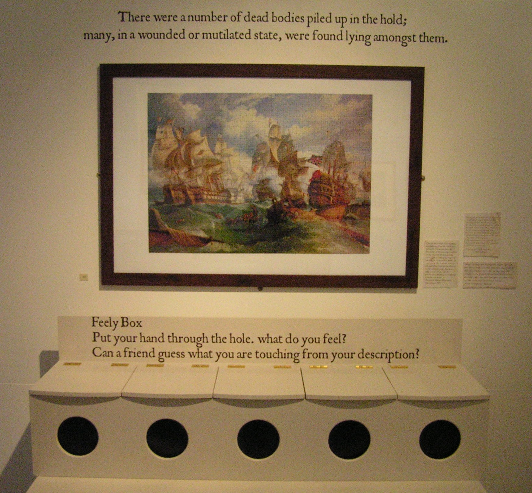
I wanted to bring Life on Board a naval ship to life for visitors. I designed a ‘feely box’…complete with ship’s biscuits and a stuffed rat.
I chose cartoon characters to lead visitors around the exhibition explaining their roles on board.
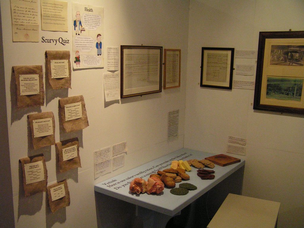
I tried to make the exhibition fun. Here, visitors could put together a week’s worth of food, look at recipes and learn about the effects of scurvy.
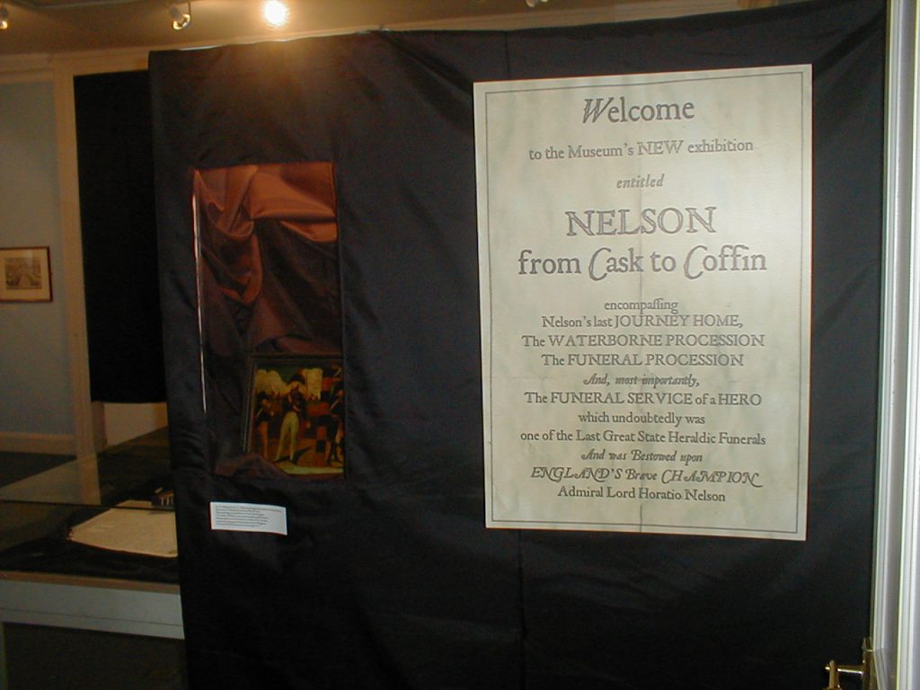
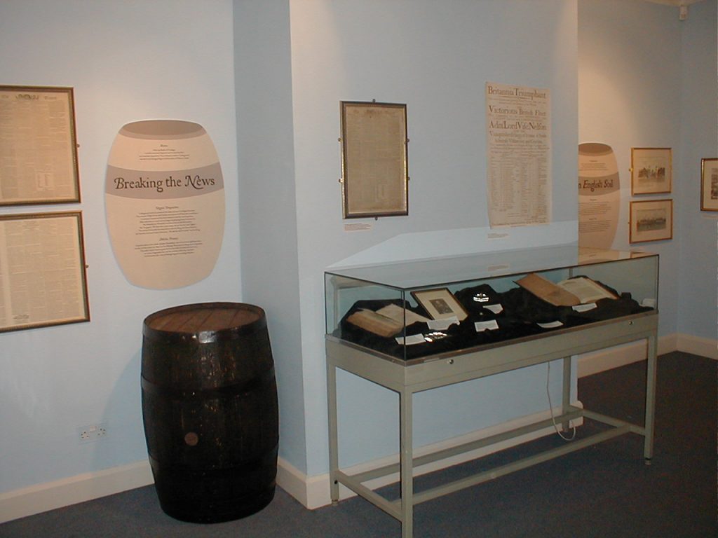
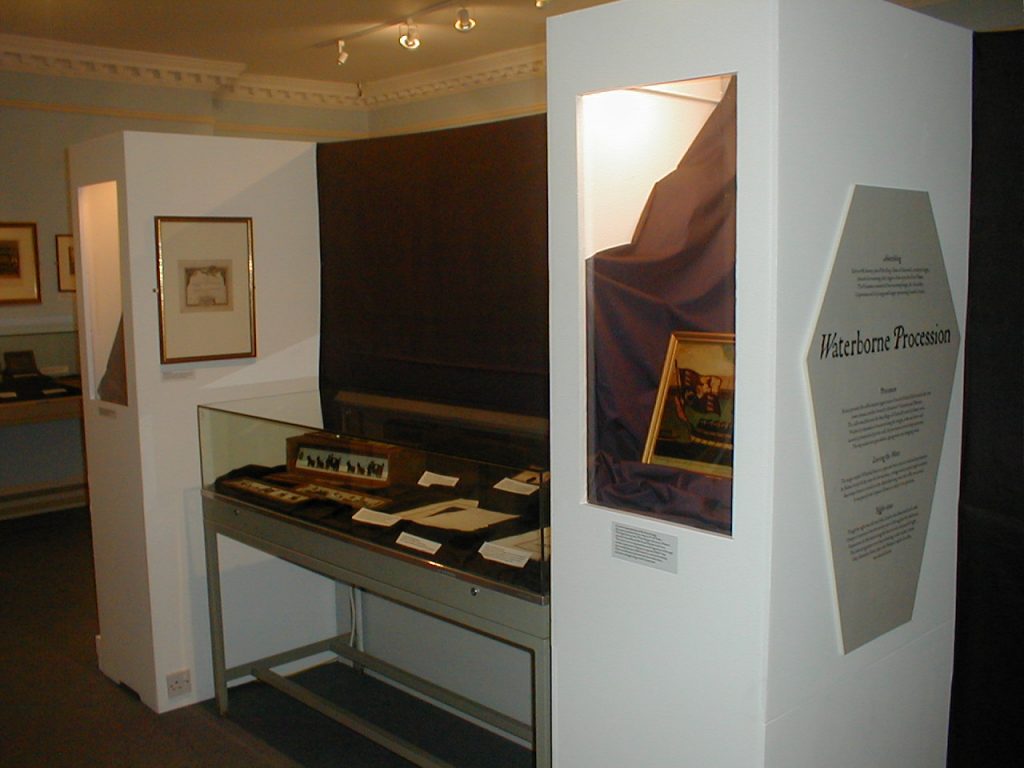
"From Cask to Coffin" at the Nelson Museum, Great Yarmouth
Admiral Lord Nelson’s body was repatriated in a cask of brandy after the Battle of Trafalgar. My exhibition explained the journey and funeral.
I designed text panels shaped like casks (barrels) for the journey section and shaped like coffins for the funeral section.
To create atmosphere I draped the room, windows and cabinets in black velvet, lowered the lights and played subtle mourning music.
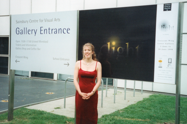
"Light" at the Sainsbury Centre, Norwich; my design exhibition for my M.A.
Opening evening with the panel I’d designed, showing light illuminating the darkness in the form of sunshine from the dot on the ‘i’.
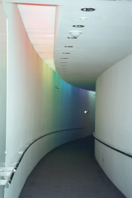
A rainbow entrance corridor showing the prismatic effect of light
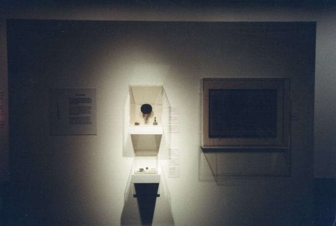
I was responsible for designing and interpreting light in ancient Greece, Rome and Egypt.